The East Runs Red
Transmedia Design & Narrative
Transmedia Design & Narrative
In the Chinese conception of history, fact and fiction, history and myth, are interwoven in such a way that the reader cannot tell them apart.
Stephen Teo
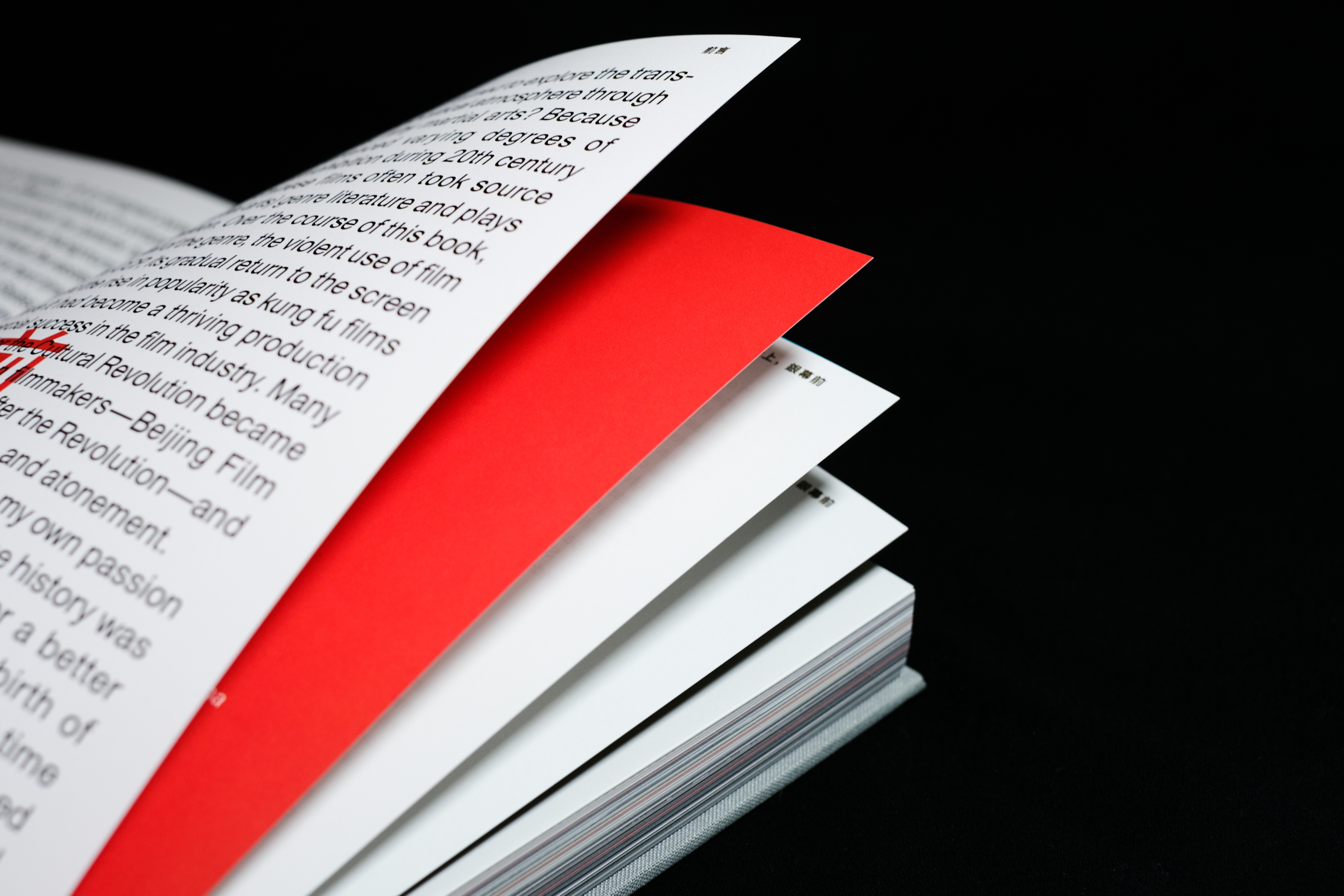
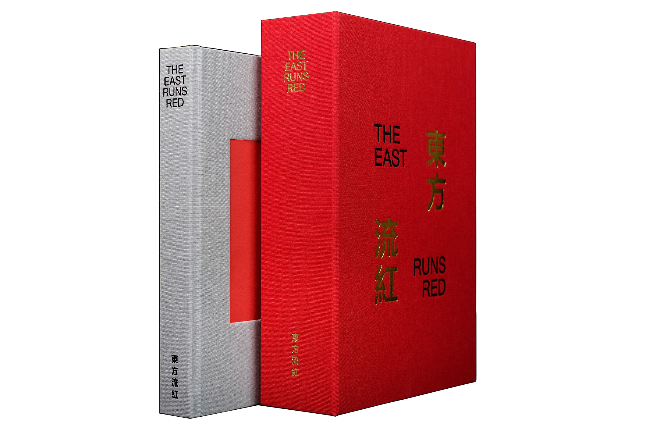
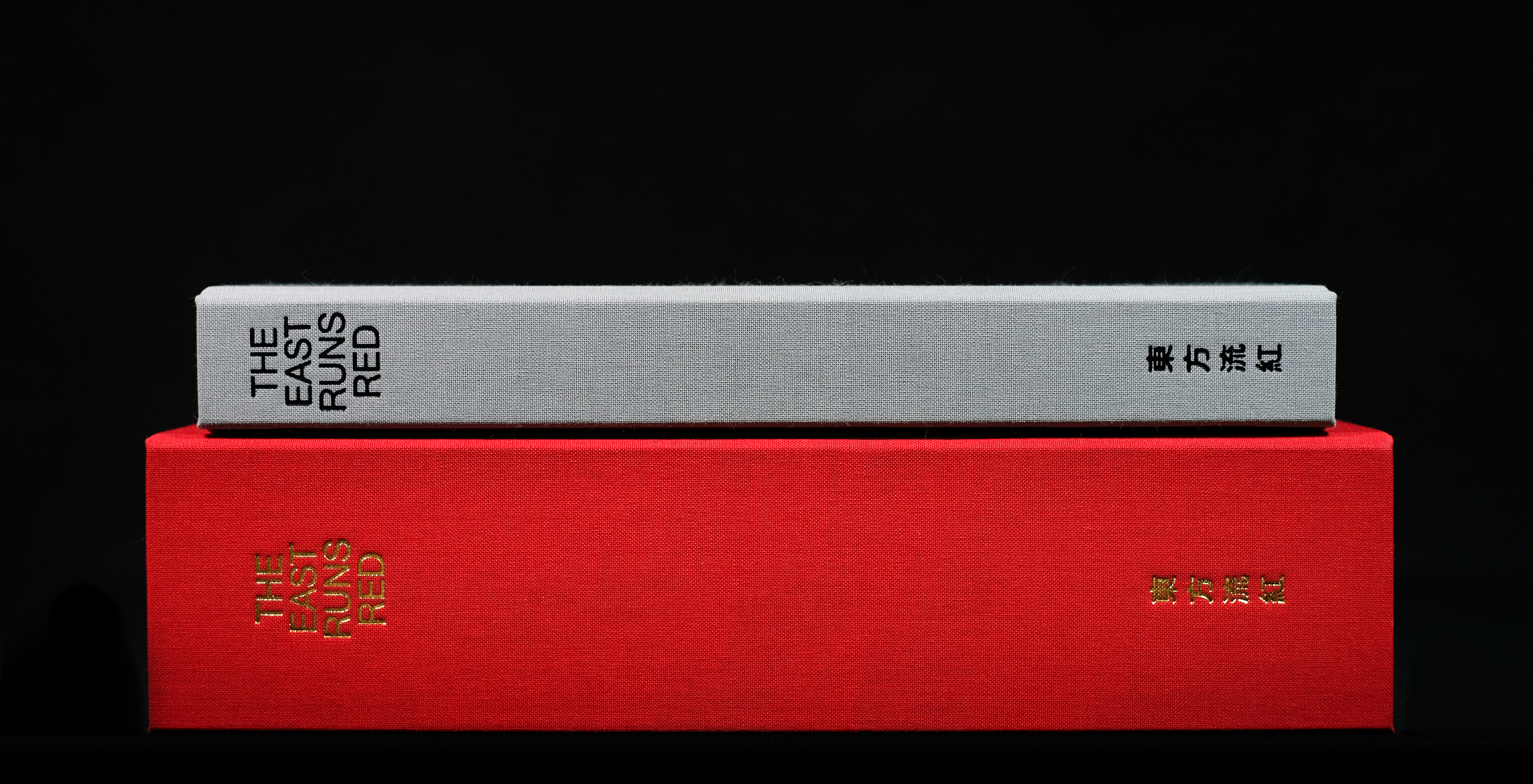
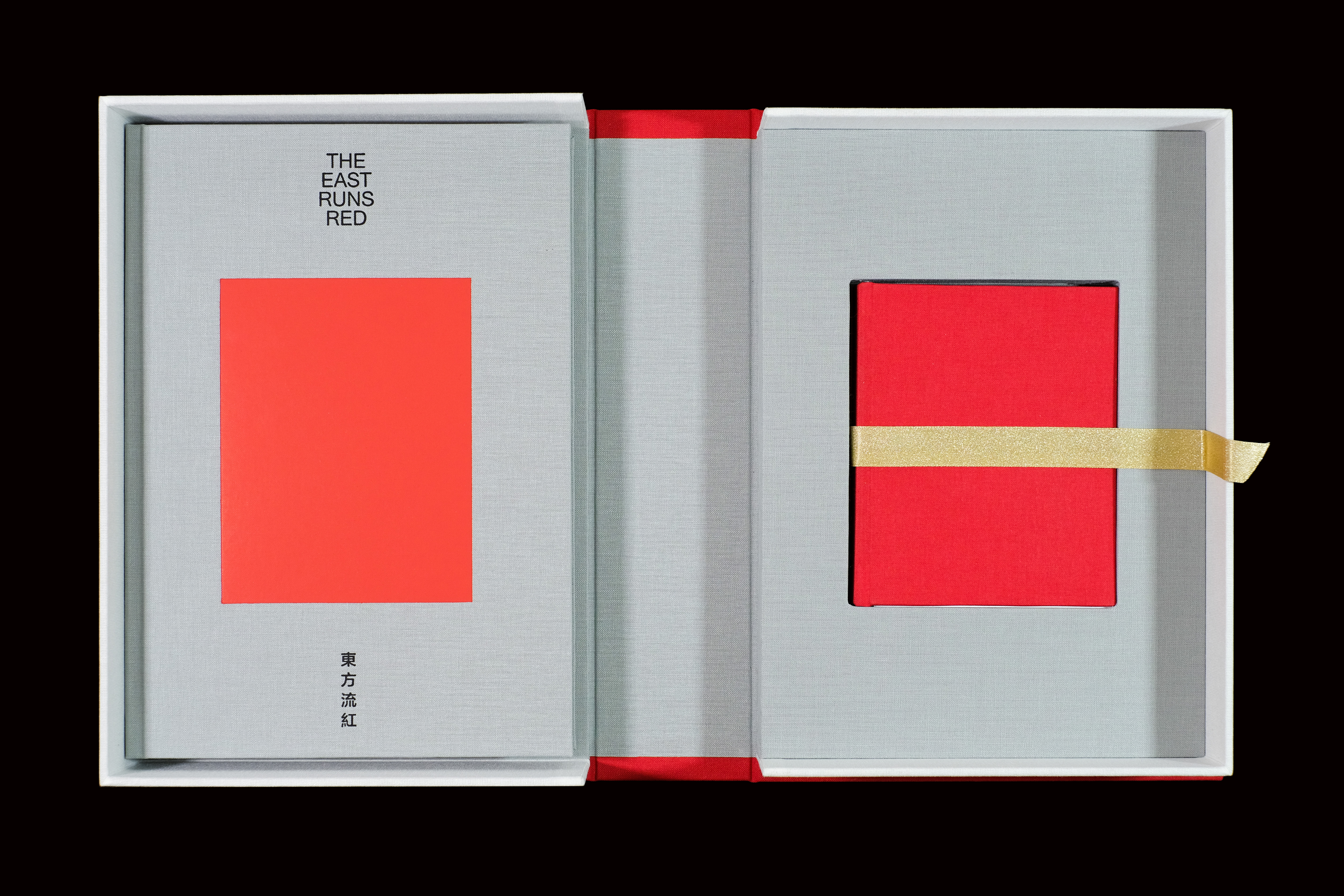
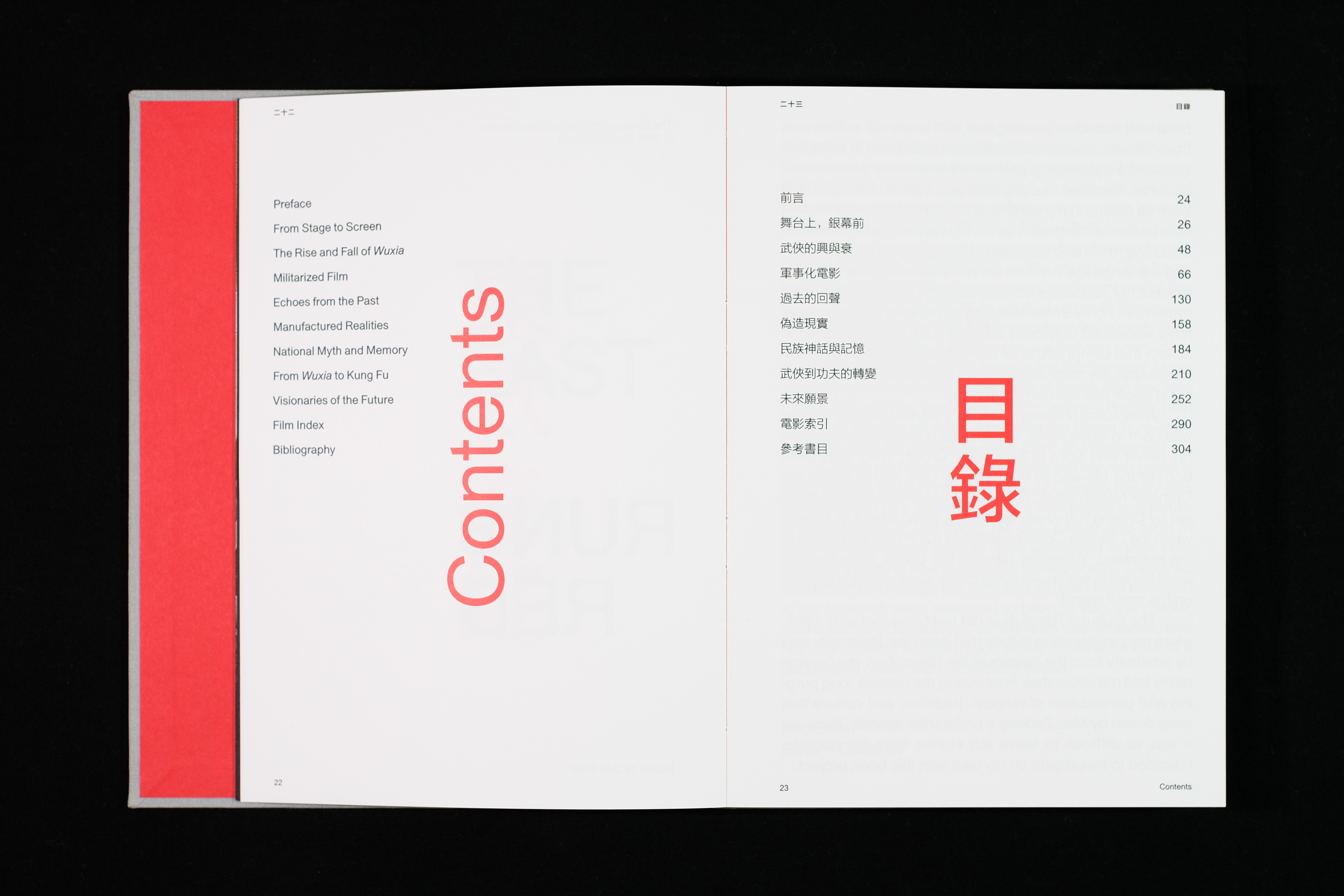
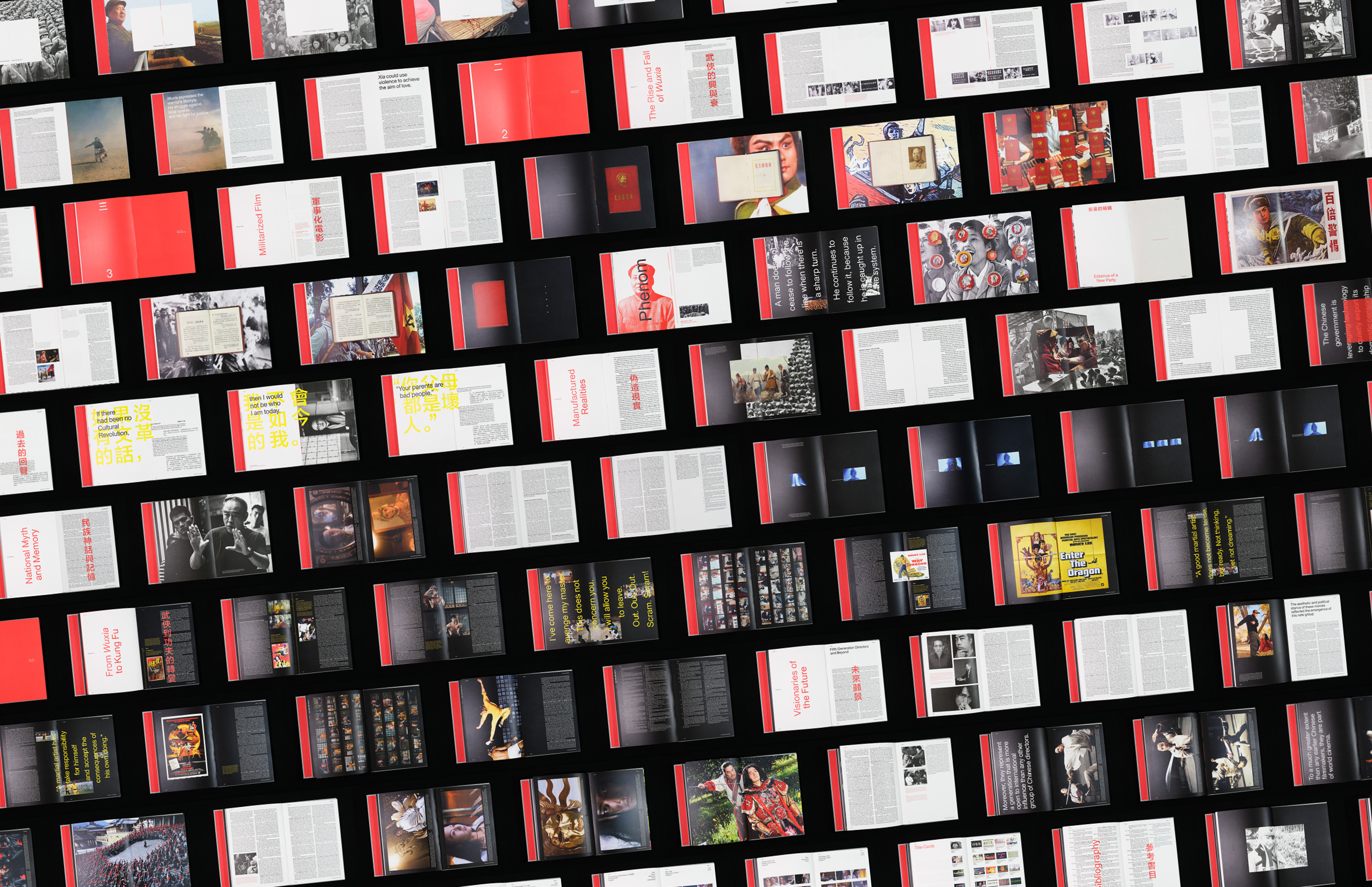
The East Runs Red is a narrative that began as a book designed from extensive research to investigate modern Chinese history through the lens of Chinese martial arts cinematic legacy. This project allowed me to exercise my skills in academic research and apply them to design in a meaningful way that extended beyond print media.
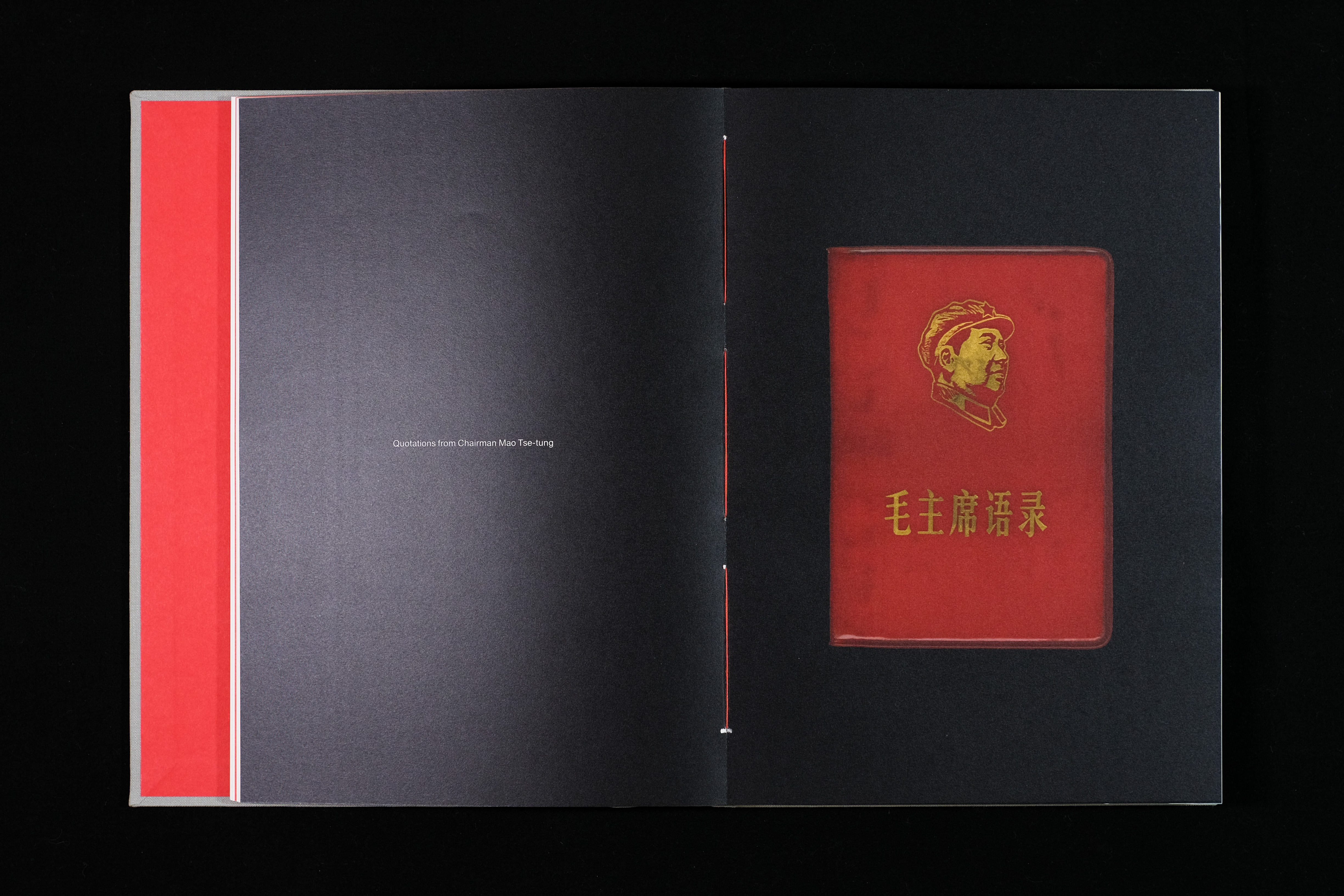
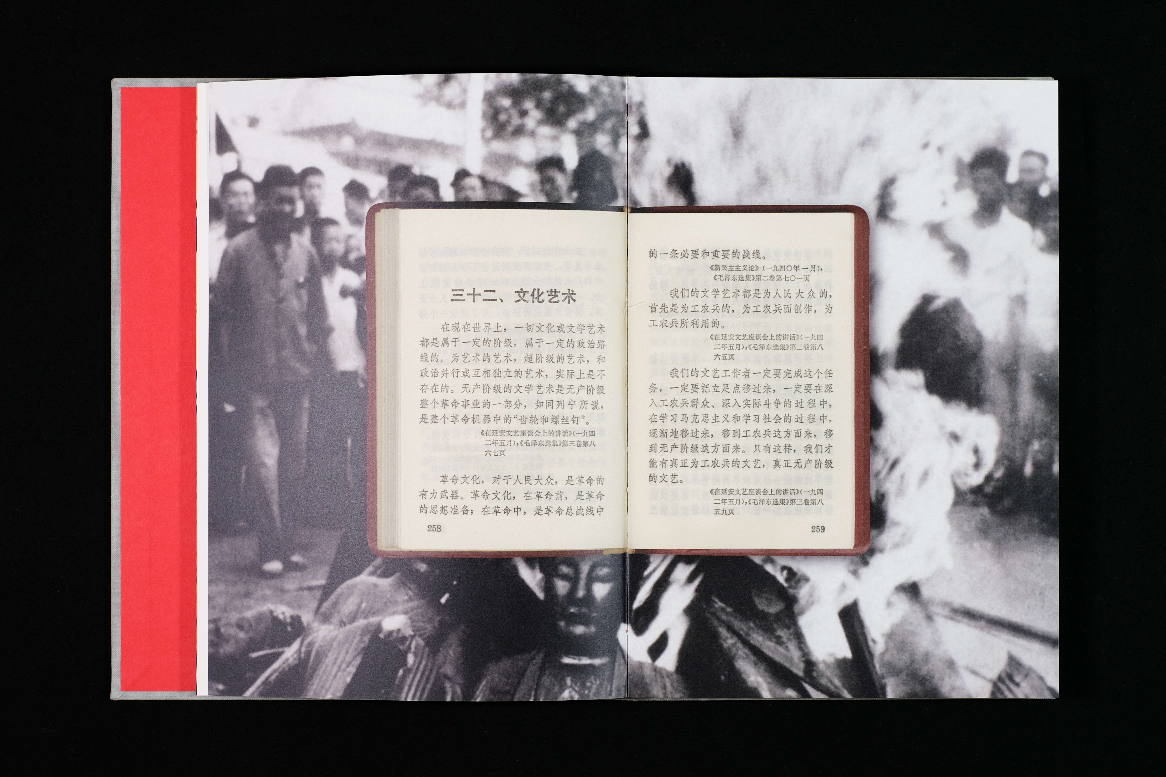
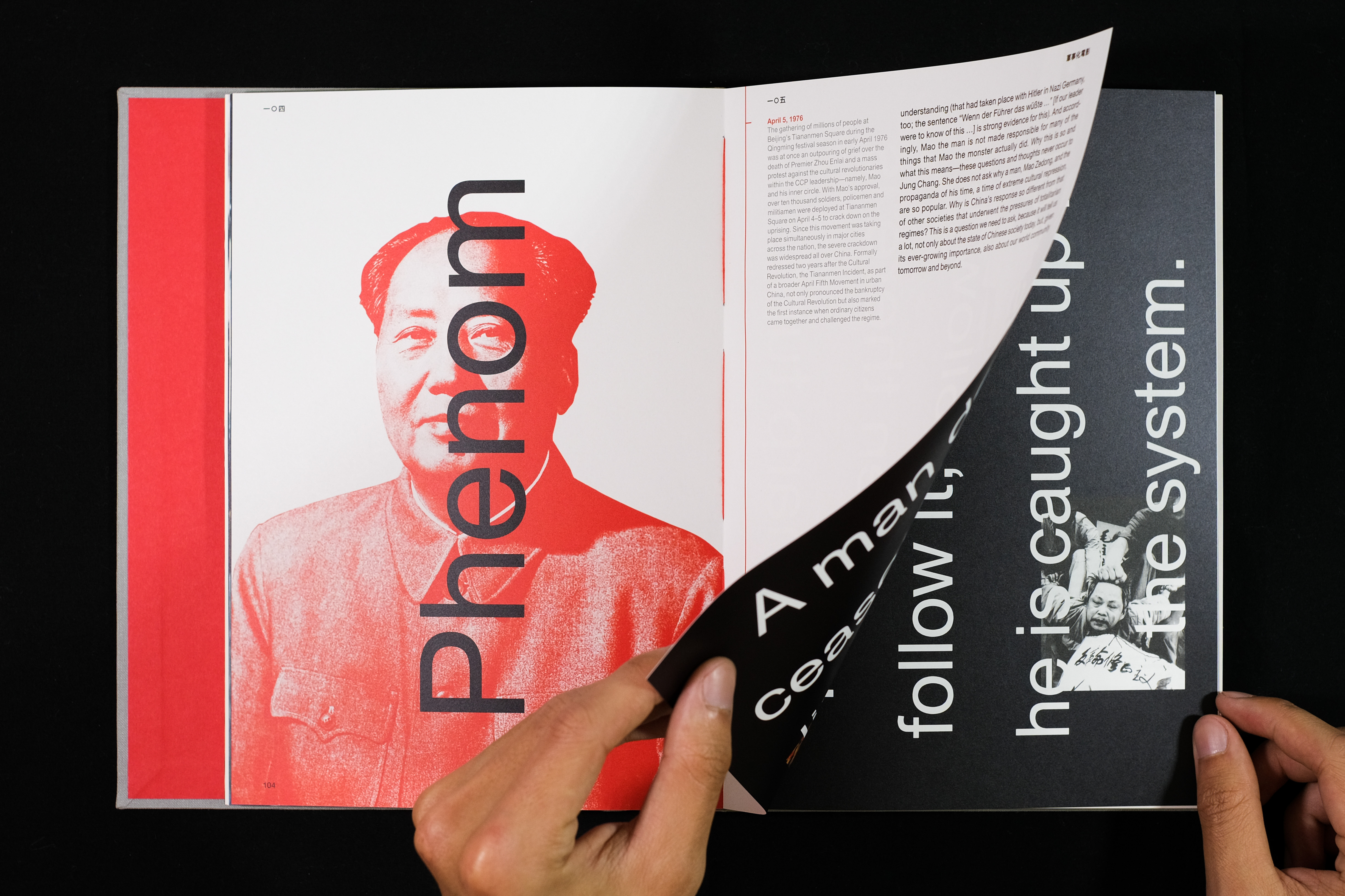
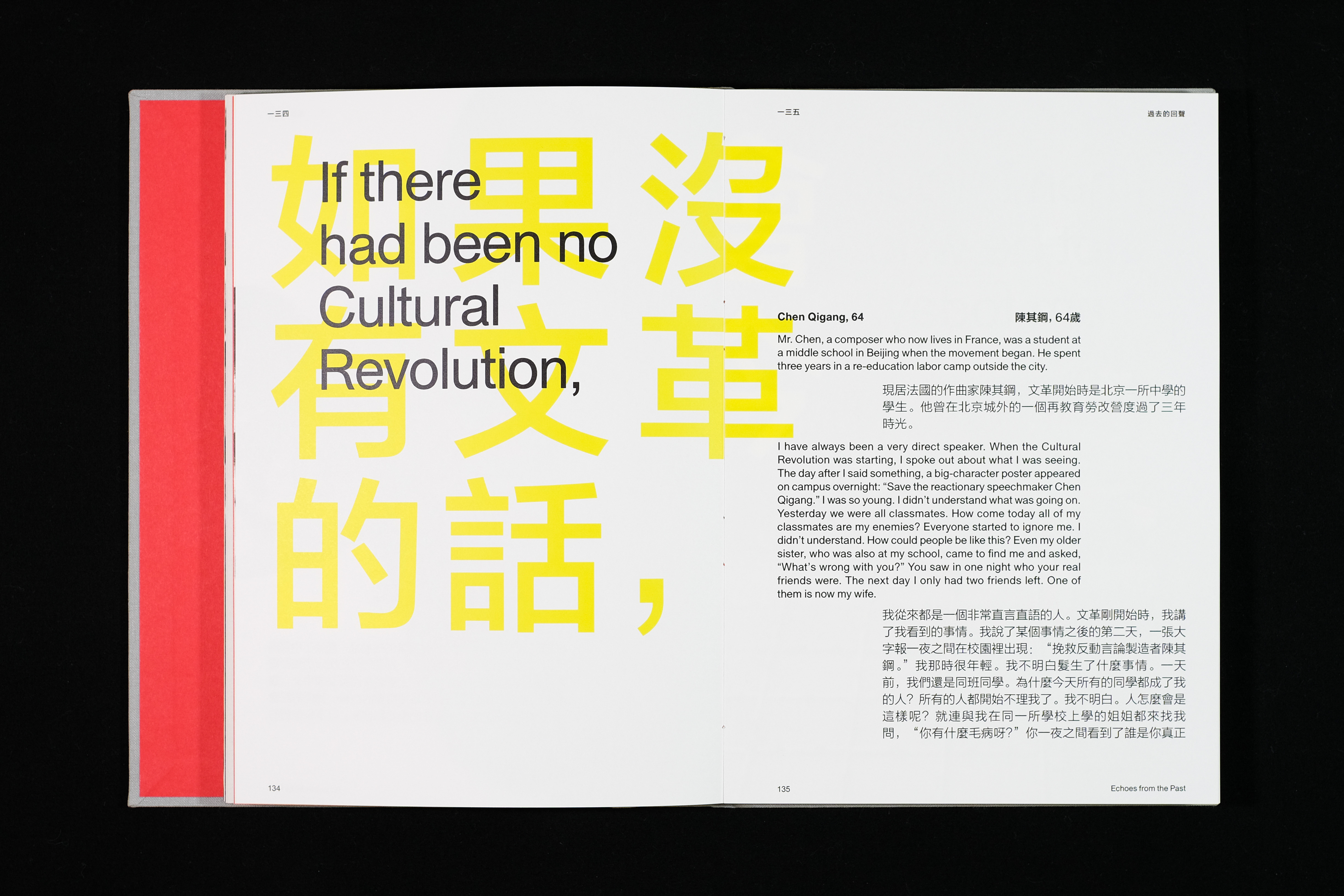
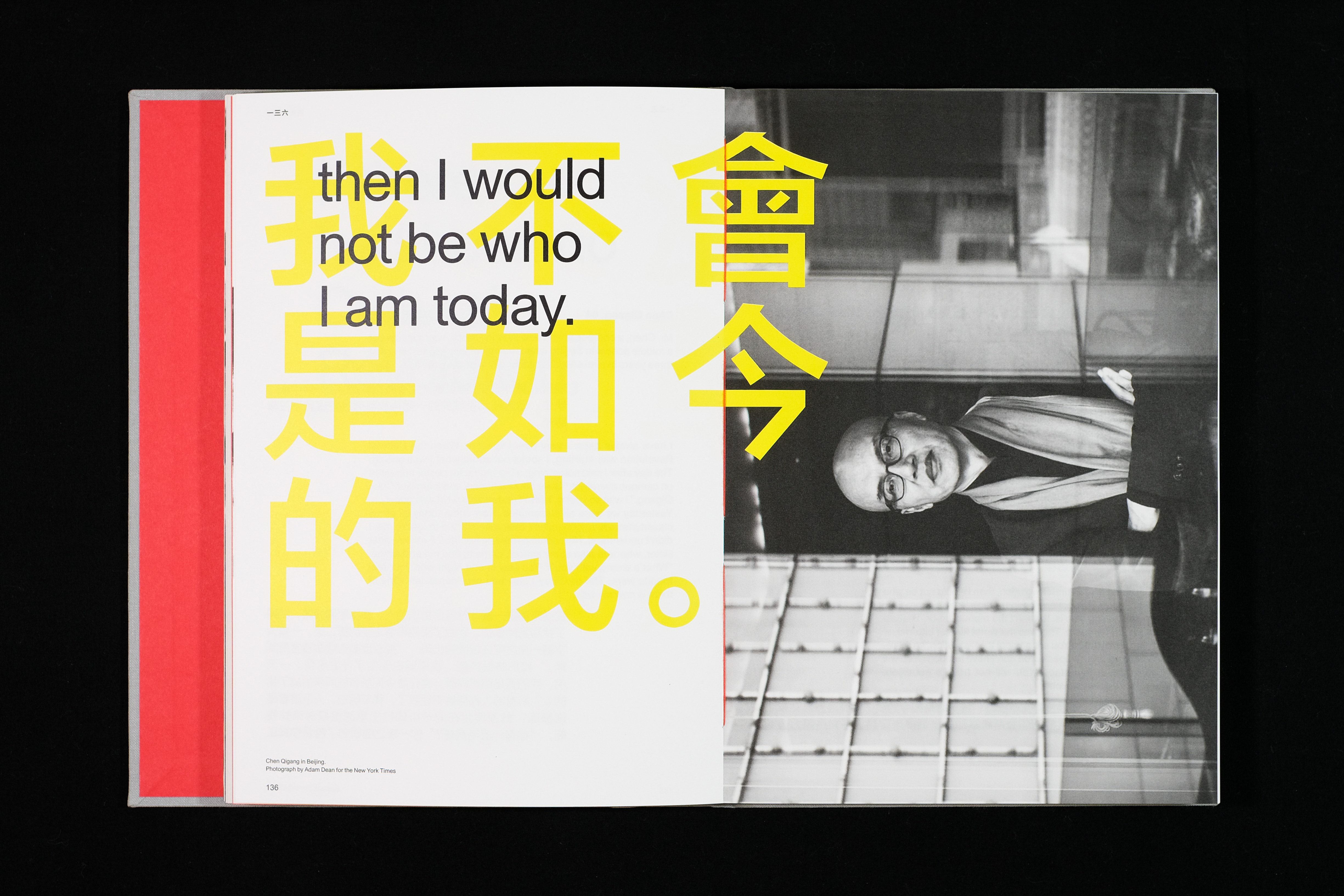
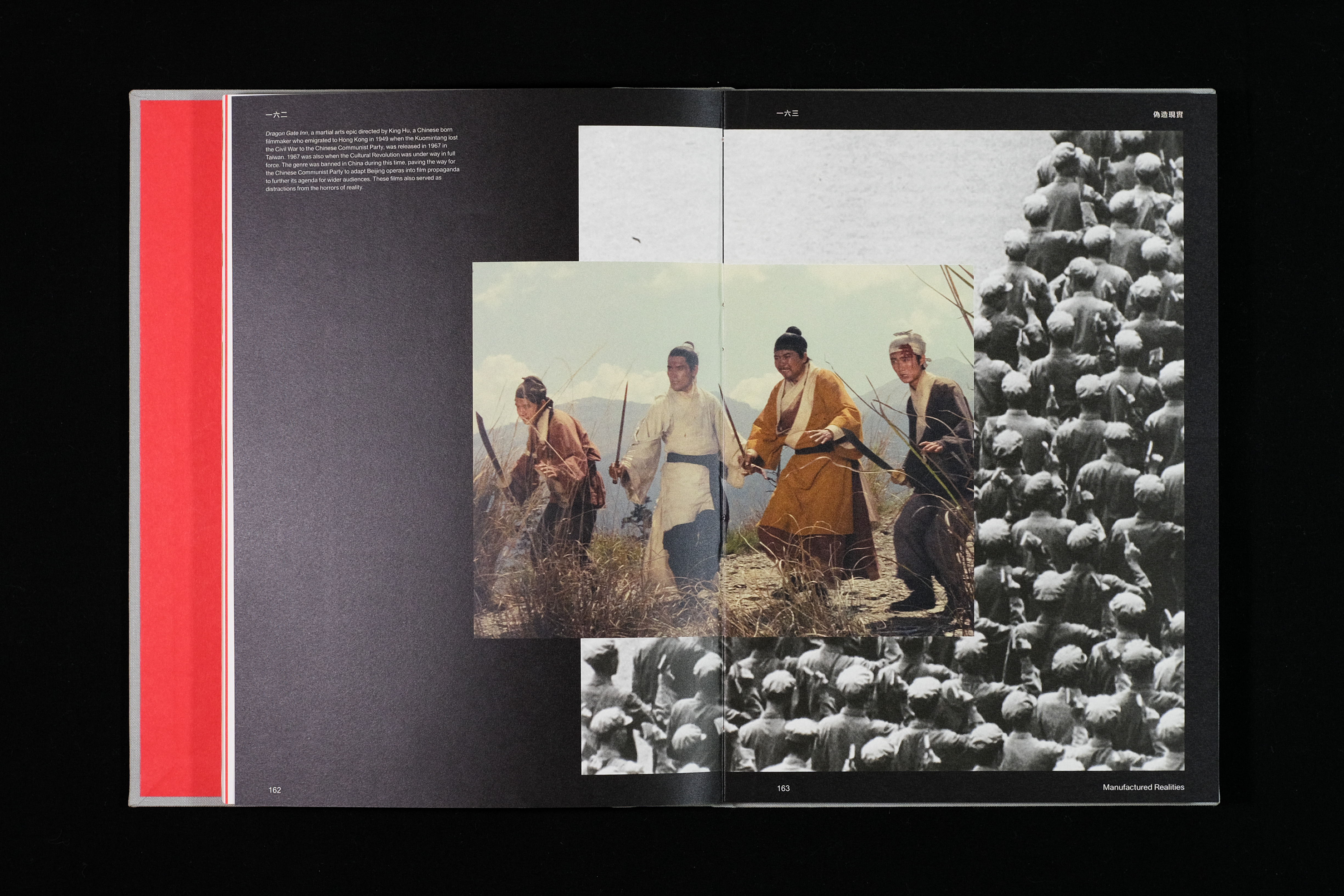
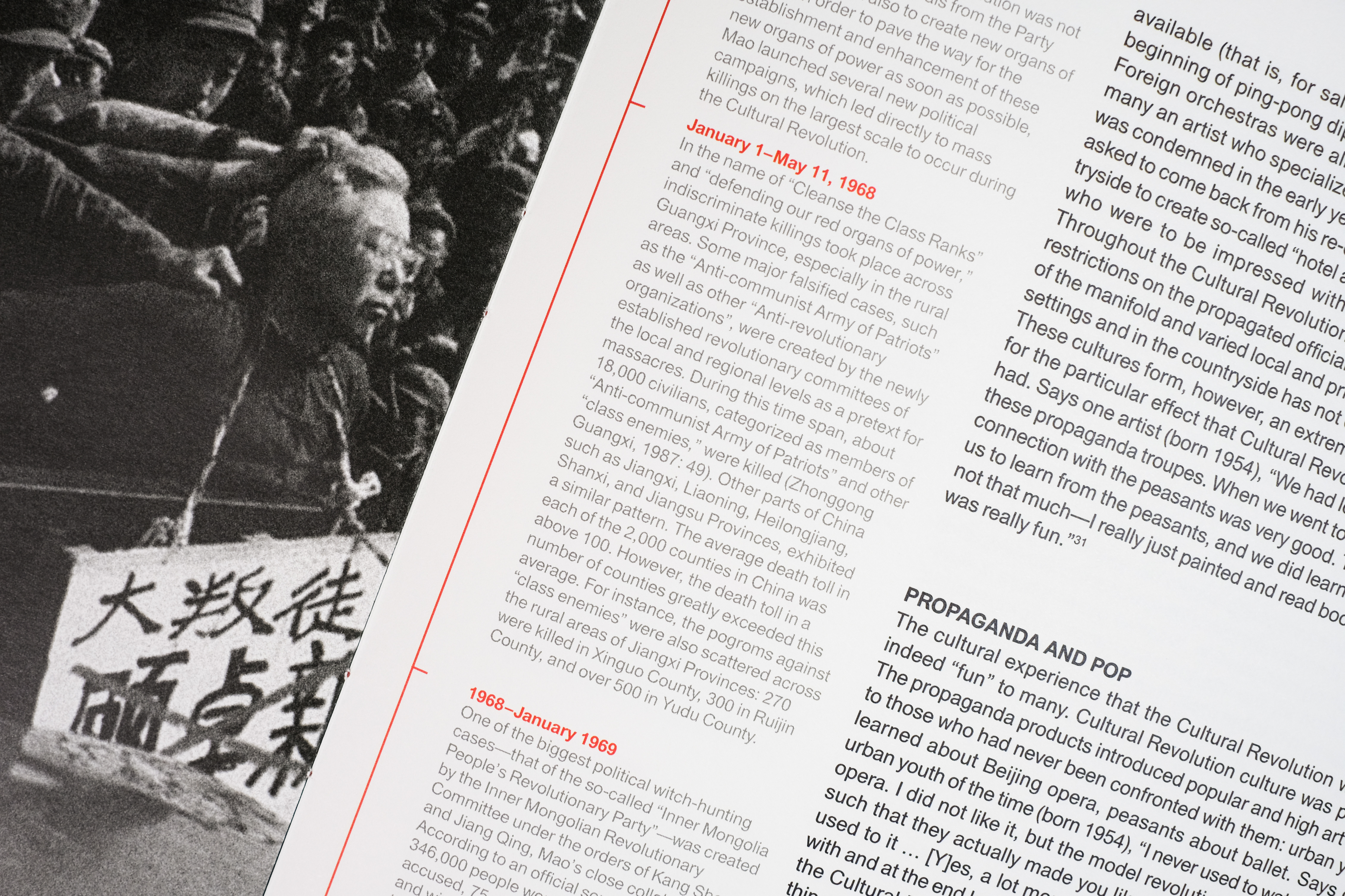
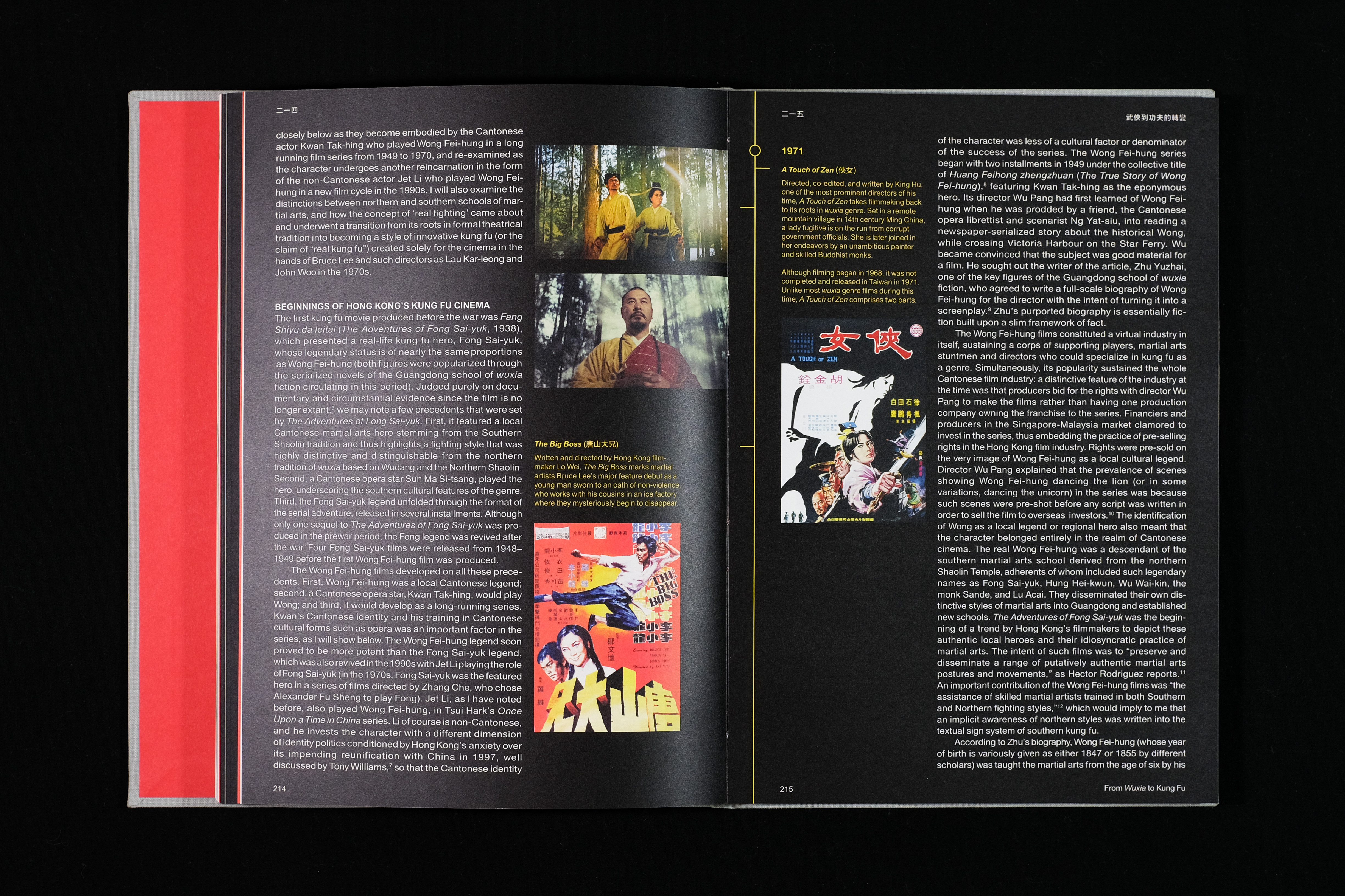
Throughout its literary history, wuxia (martial arts fiction) was adapted to fit contemporary narratives and propaganda, most notably when it was used by the Chinese Communist Party (CCP) during Mao’s rise to power. Socio-political turmoil swelled during the Chinese Civil War and drove filmmakers from Shanghai, where wuxia was censored and eventually banned, to Hong Kong and Taiwan where they flourished and fearlessly depicted the perseverance of heroes overcoming tyranny, a reflection of the struggles that contributed to the diaspora of Chinese people from their homeland. What began as a routine term project evolved into a love letter to my parents and Taiwanese-American cultural heritage.
Posters


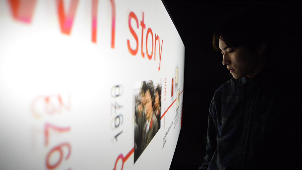
Interactive Installation

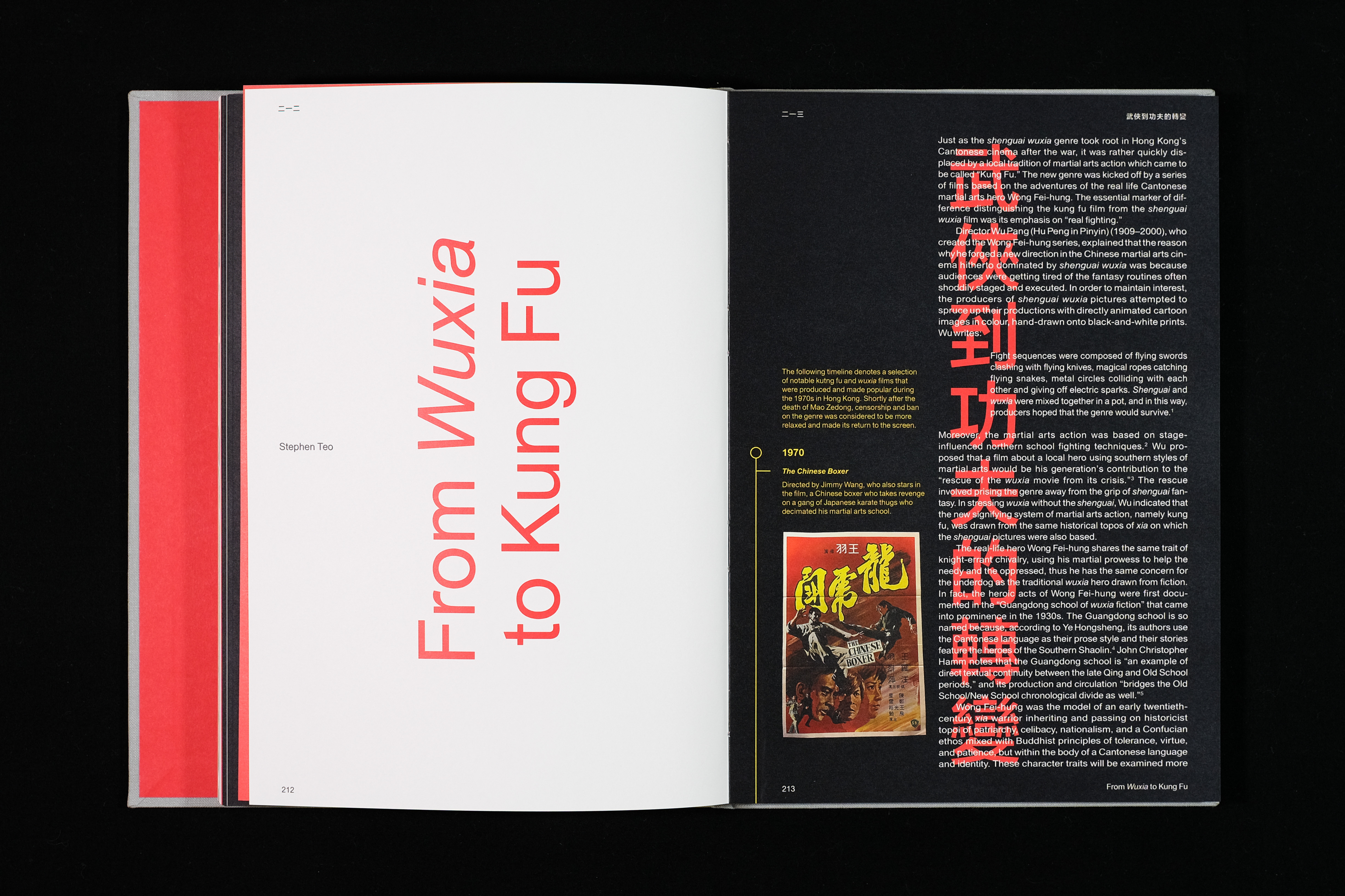
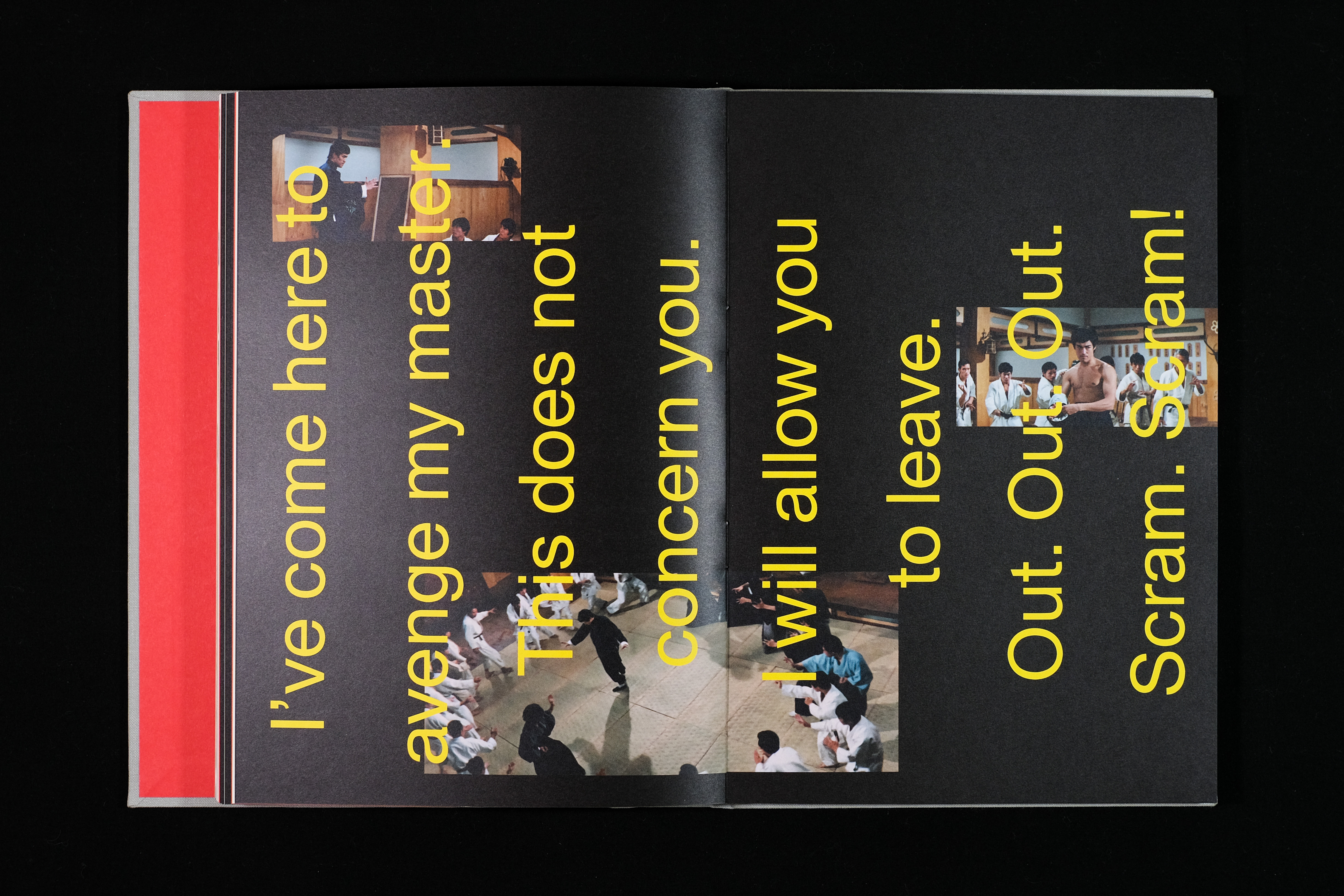
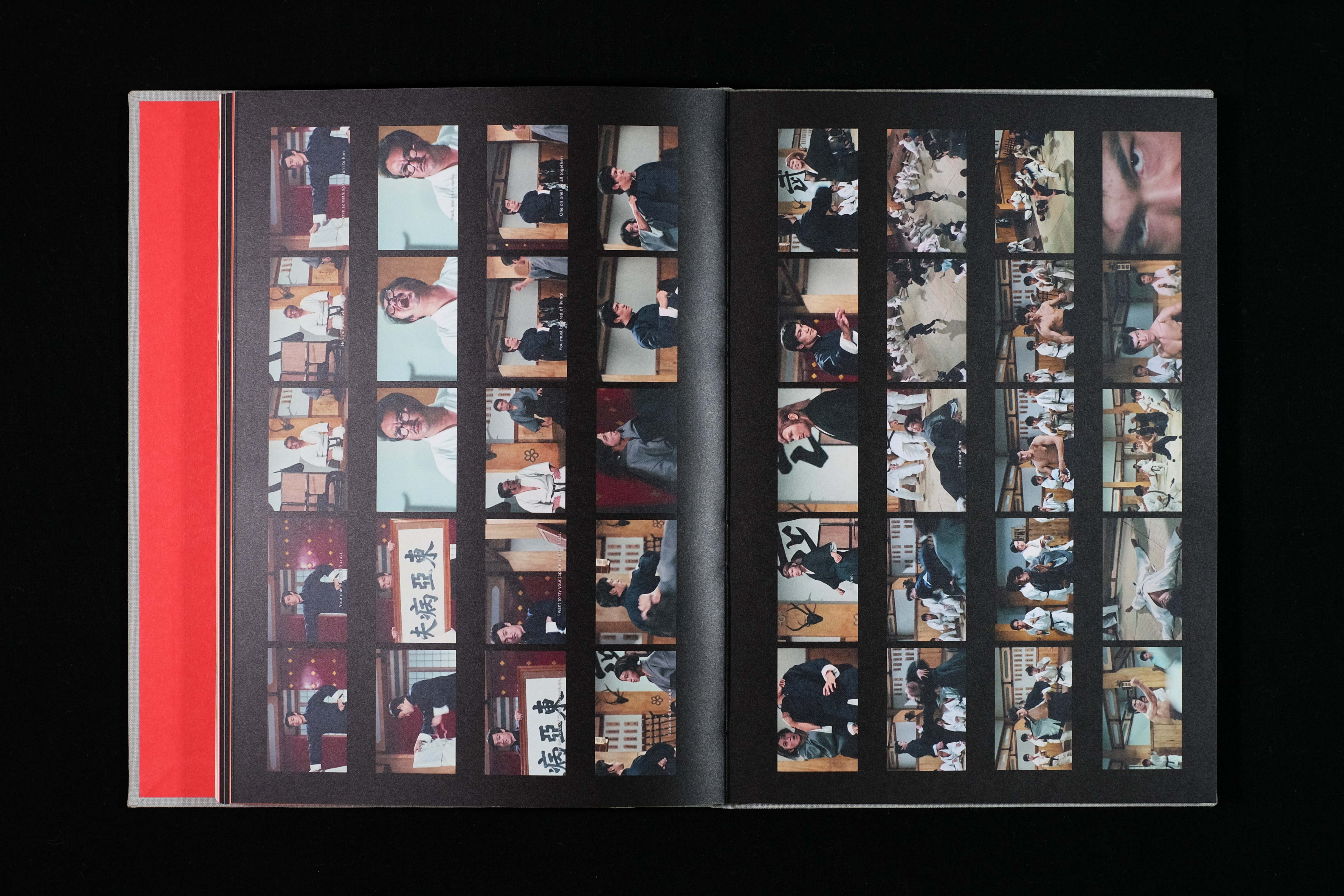
The interactive installation is a spatial extension of the book that continues the narrative in The East Runs Red beyond print design. The dual timelines provide visual information of major events in modern China and its juxtaposition to notable wuxia and kung fu film releases provide users to draw causal–correlation connections between the two. To augment the experience, the timelines are equipped with code and a sensor that detects user presence in the space between the projections to allow them to pace their own read.
Recognition—
Community Choice Prize in Visual Communication, Core77 Design Awards 2019
Student Runner Up in Visual Communication, Core77 Design Awards 2019
2019 Design Shortlist, Communication Arts
ArtCenter Student Gallery, Spring 2018
Community Choice Prize in Visual Communication, Core77 Design Awards 2019
Student Runner Up in Visual Communication, Core77 Design Awards 2019
2019 Design Shortlist, Communication Arts
ArtCenter Student Gallery, Spring 2018
Credits—
Brad Bartlett, instructor
Ivan Cruz, instructor
Miles Mazzie, instructor
Daniel J. Kim, book photographer
Special Thanks—
Carina Huynh, Pan Hu, Hyek Im, Yuino Kumamoto, Yi Mao (中文翻譯)
Brad Bartlett, instructor
Ivan Cruz, instructor
Miles Mazzie, instructor
Daniel J. Kim, book photographer
Special Thanks—
Carina Huynh, Pan Hu, Hyek Im, Yuino Kumamoto, Yi Mao (中文翻譯)
LA Shorts Film Festival
Transmedia Branding
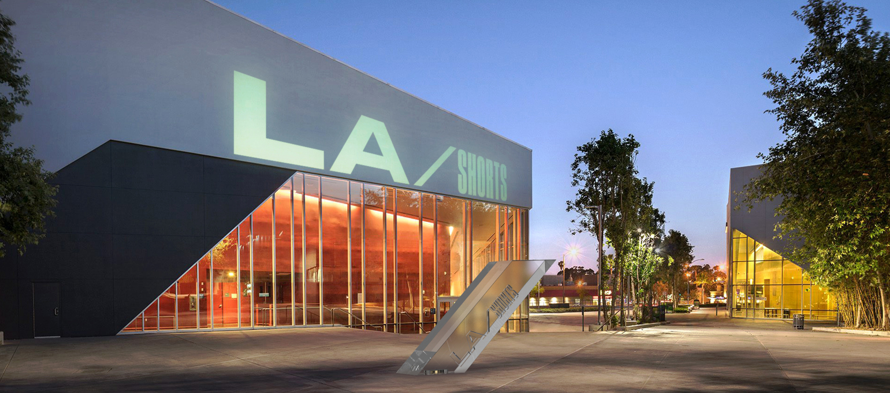
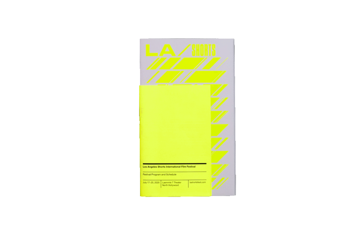
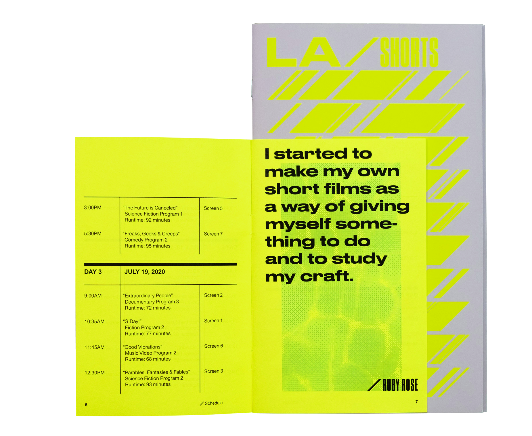
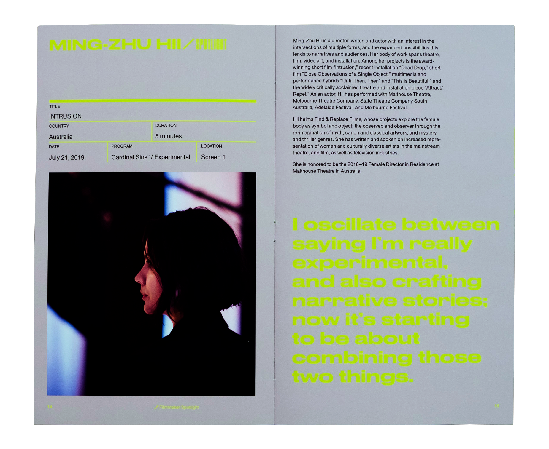
The Los Angeles Shorts International Film Festival is the longest-running annual short film festival that celebrates short film achievements of industry newcomers and veterans. This rebrand brings into focus the essence of filmmaking with graphic elements inspired by the slate board and script, as well as LA's vibrantly unapologetic attitude that attracts aspiring filmmakers to the city.
I chose to hypothetically rebrand LA Shorts for my interest in cinema culture and opportunity for me to explore the short film format. This project allowed me to apply and better understand the fluidity of branding across multiple media types for a seamless, cohesive brand experience.


The LA Shorts macro identity is dynamic and flexible to allow for the film festival to be franchised to other major cities, such as San Francisco and New York City.
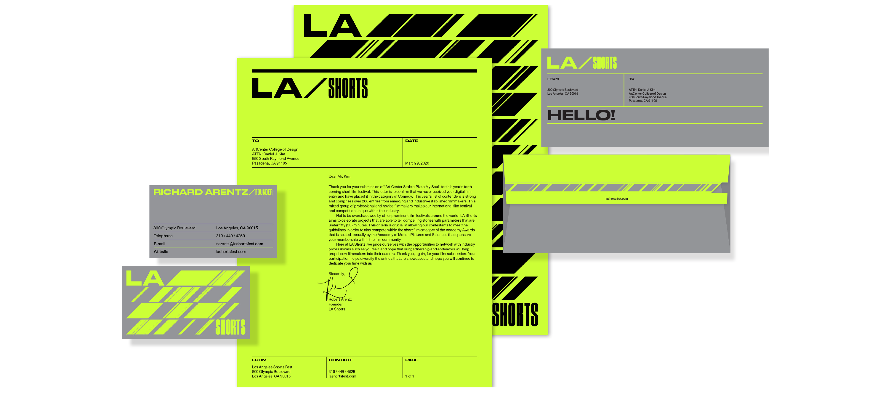

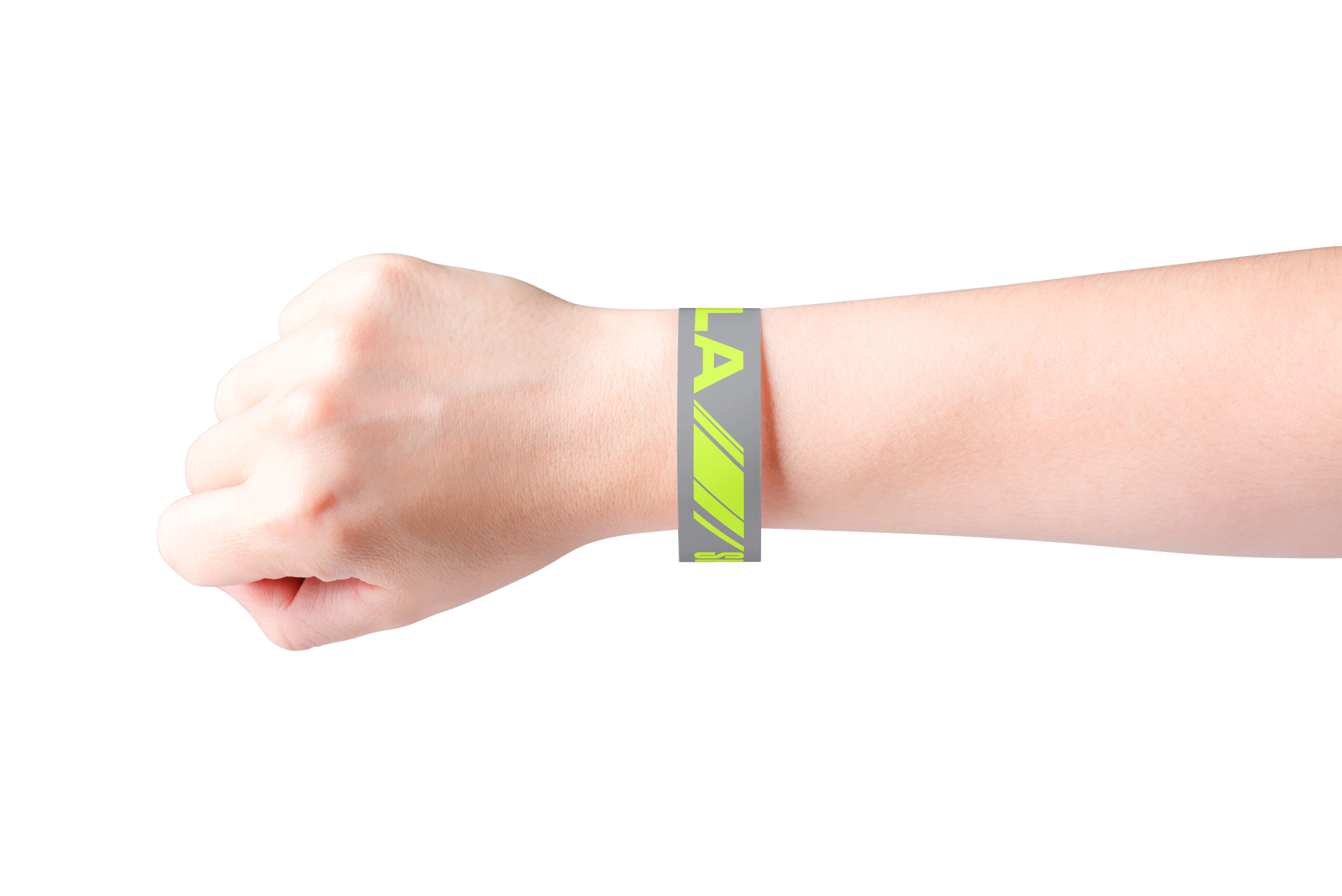
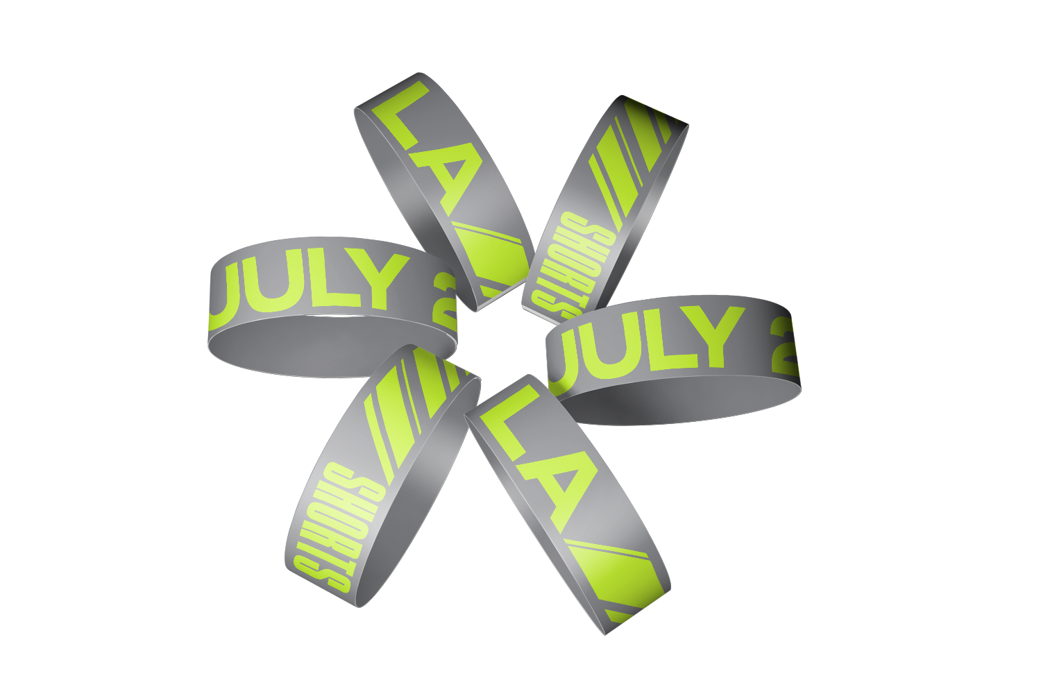
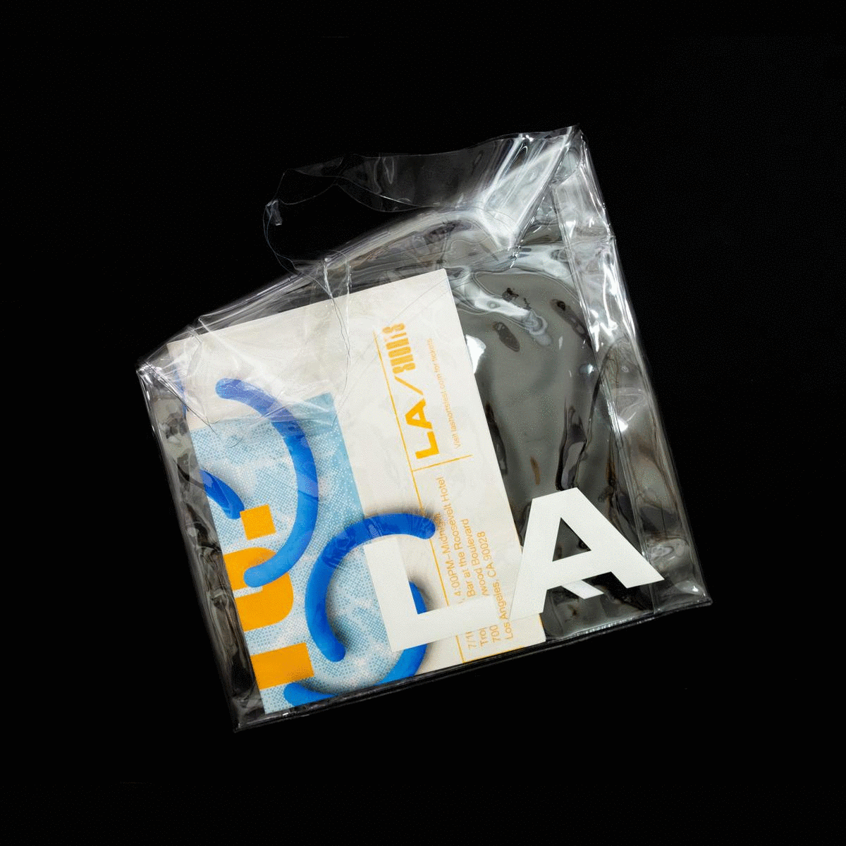
The identity seamlessly integrates across media types. From essential collateral pieces and environments to event wristbands, the graphic element from the clapperboard “slant” is flexible in its length to convey time and may be used as information containers.
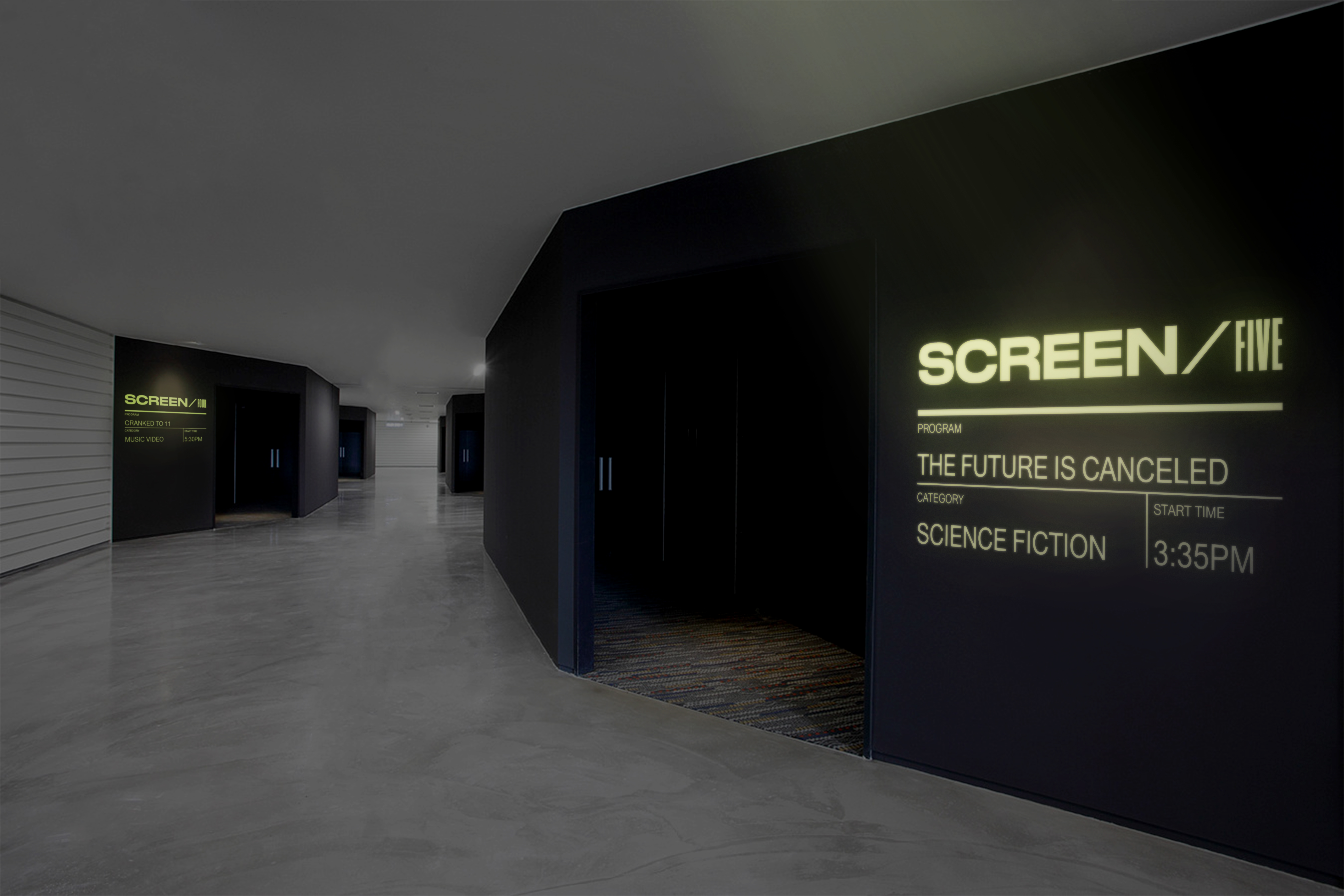
Lighting the Way
As a nod to cinema, I chose to design a projection-based wayfinding system. This allows festival organizers and producers to easily modify and update information at a moment’s notice. Projections can also be conveniently set up and dismantled at the end of the festival.

Lights! Camera! Party!
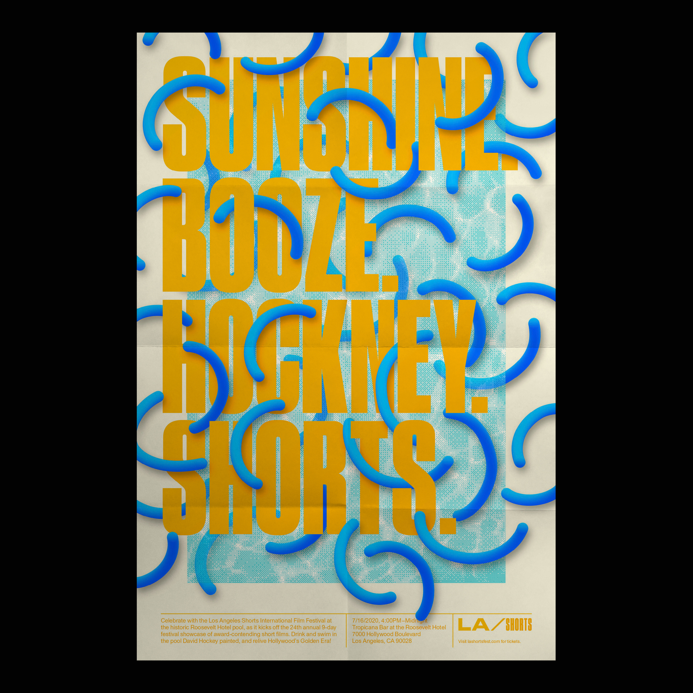
It’s not a Hollywood party without a celebration! To kick off the annual festival, I created a hypothetical pool party that would take place at the historic Roosevelt Hotel Pool as an extension to the LA Shorts brand. In true LA fashion, the party begins in late afternoon, when guests can soak up the last drops of glorious sunlight before they party hard in and around the pool painting by LA’s resident artist David Hockney.
LA Shorts At Home
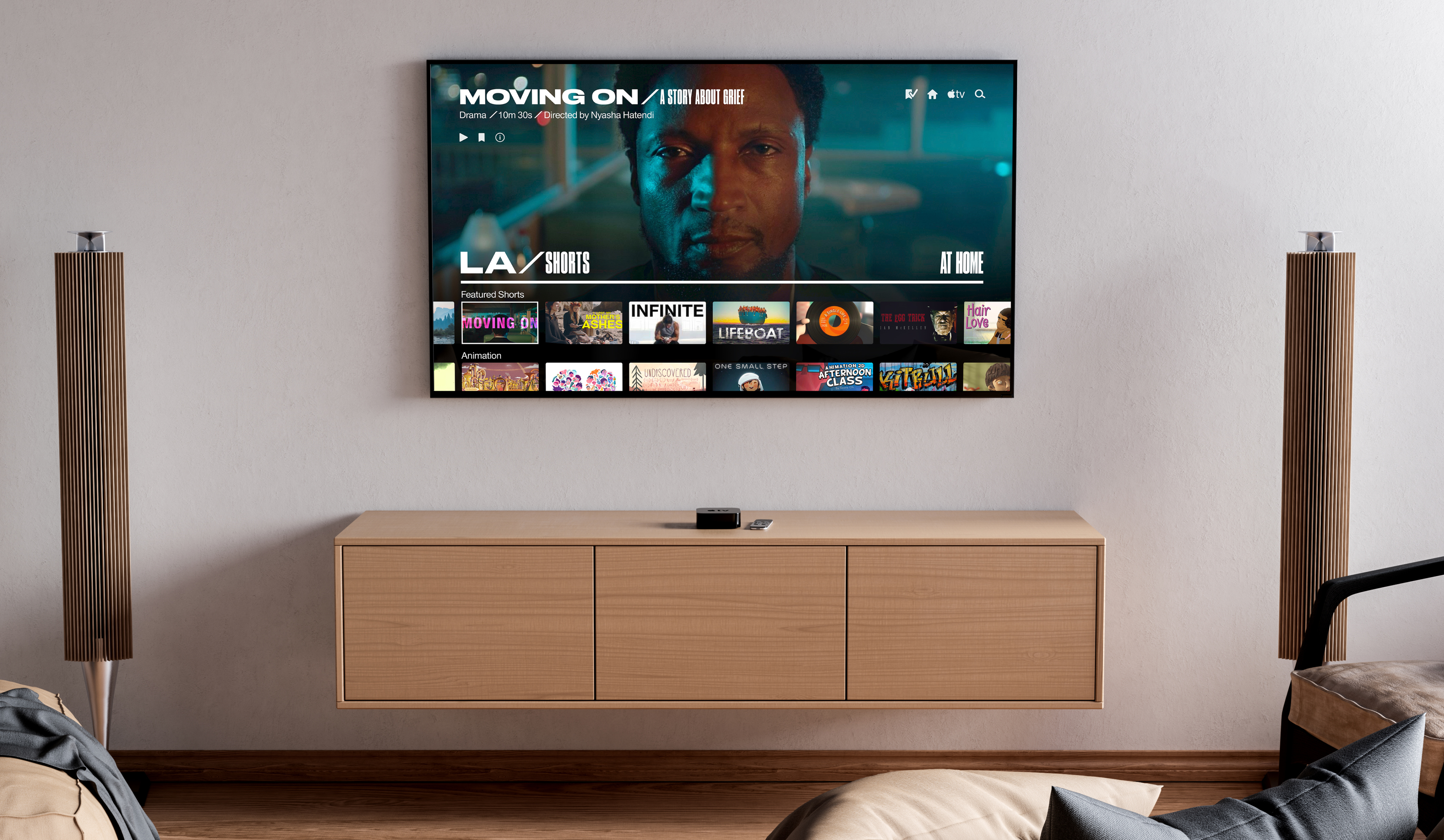
Due to the COVID-19 pandemic, I adapted the LA Shorts festival concept to be viewable as a streaming platform within the comfort and safety of home. "LA Shorts at Home" would be a downloadable app for Apple TV, Roku, Chromecast, etc. The user interface is streamlined for ease of use in this strange time when many events are forced to cancel or adapt to the times.
Credits—
Brad Bartlett, instructor
Brad Bartlett, instructor
FRAME × FRAME for LA Shorts
Transmedia Branding
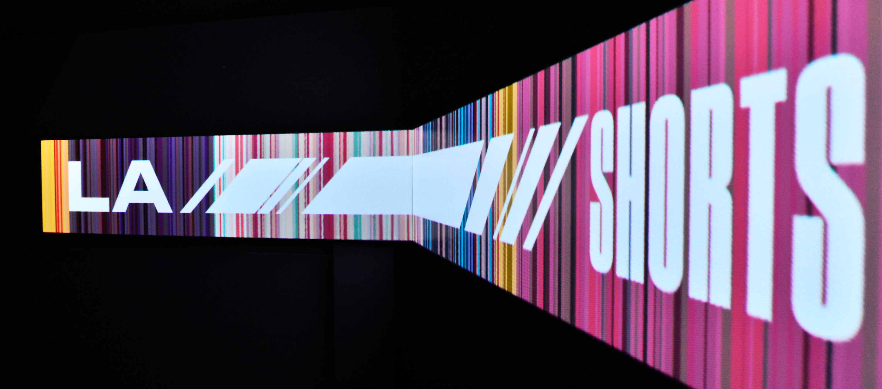
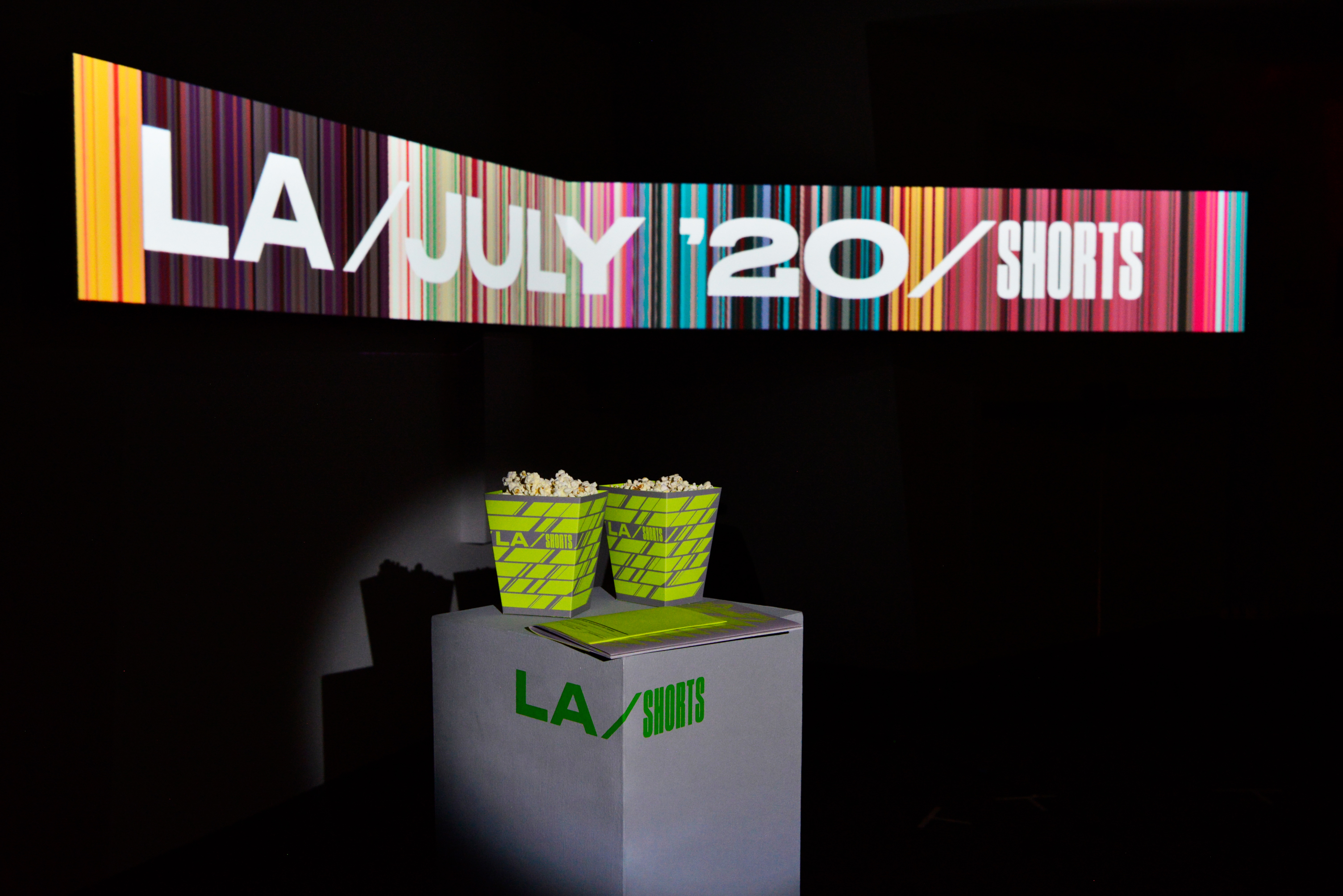
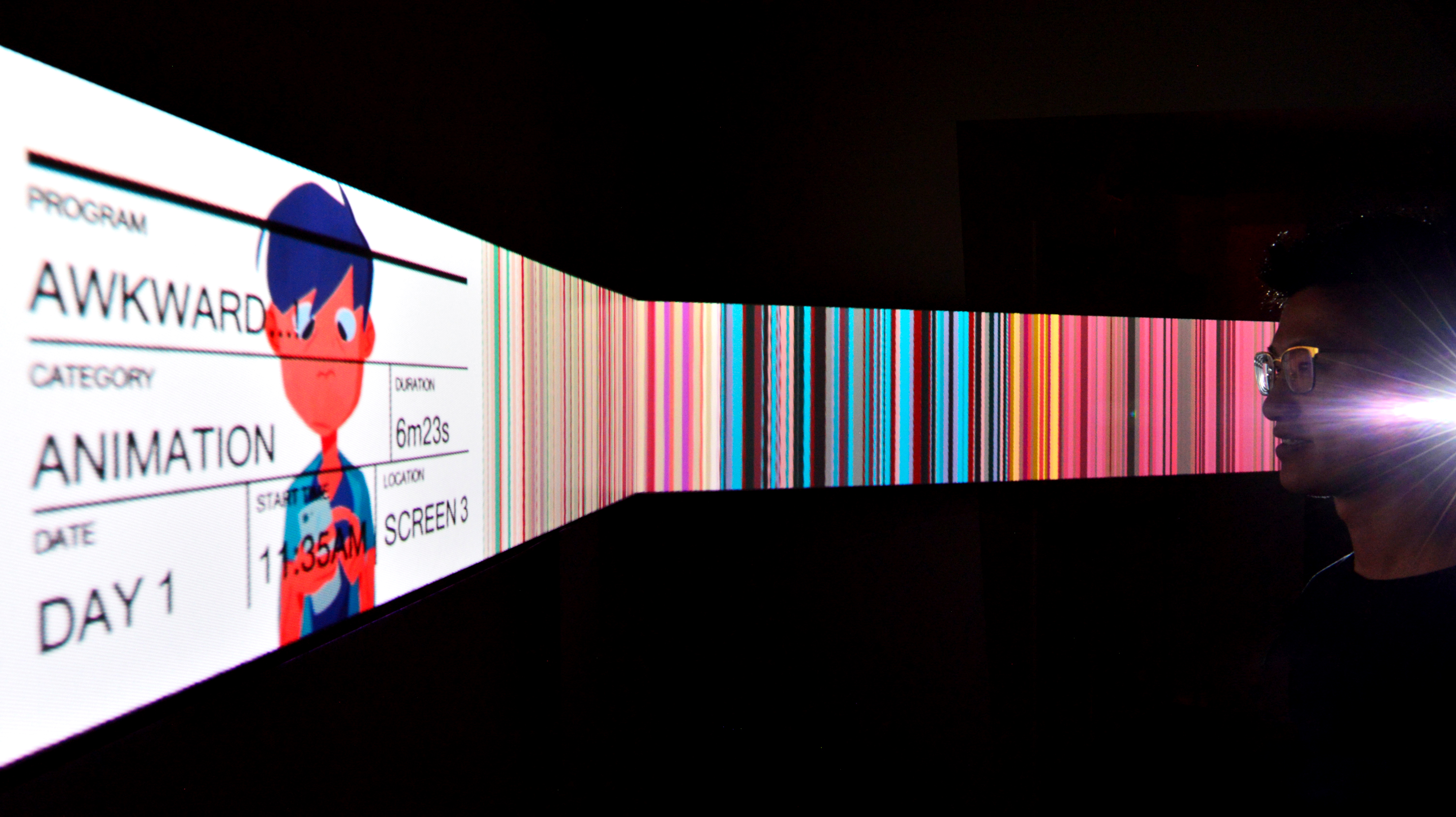
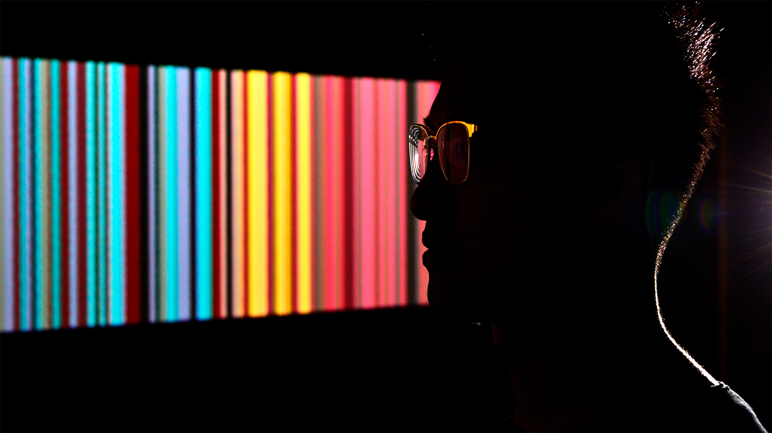
FRAME × FRAME is a hypothetical brand extension of the LA Shorts Film Festival, created as an interactive spatial installation that augments the LA Shorts experience by showcasing a conceptual way of seeing short films. With Processing code, each vertical strip is averaged within each frame, abstracting them the films into its simplest visual forms. This project allowed me to practice conceptual thinking and apply it to an immersive technological experience through interaction and projection mapping for an informative and visually dimensional takeaway.
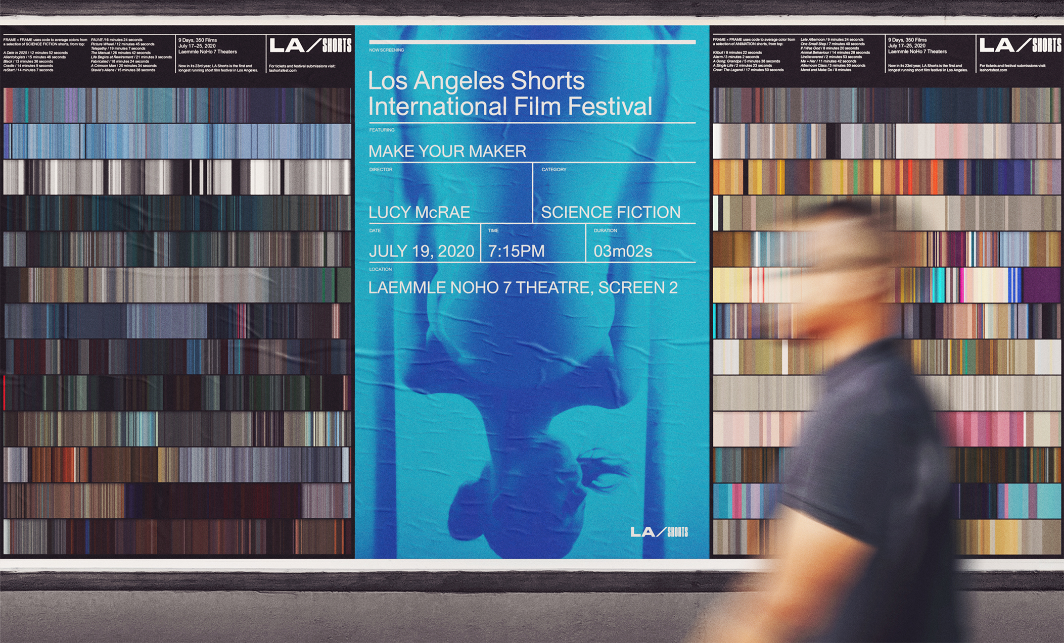

Curtains to Barcodes
The interactive installation is a spatial extension of LA Shorts, which would live along the interior perimeter of the lobby theater. With code and sensors, festival attendees would approach a barcode of colors, which would part to reveal the trailers and showtimes of a featured short film. This gives attendees the chance to experience the festival program beyond its printed matter along with popcorn in branded boxes for a deliciously memorable experience.
Back to LA Shorts︎︎︎
Credits—
Brad Bartlett, instructor
Ivan Cruz, instructor
Miles Mazzie, instructor
Eric Santibanez, instructor
Alpha Lung, model
Brad Bartlett, instructor
Ivan Cruz, instructor
Miles Mazzie, instructor
Eric Santibanez, instructor
Alpha Lung, model
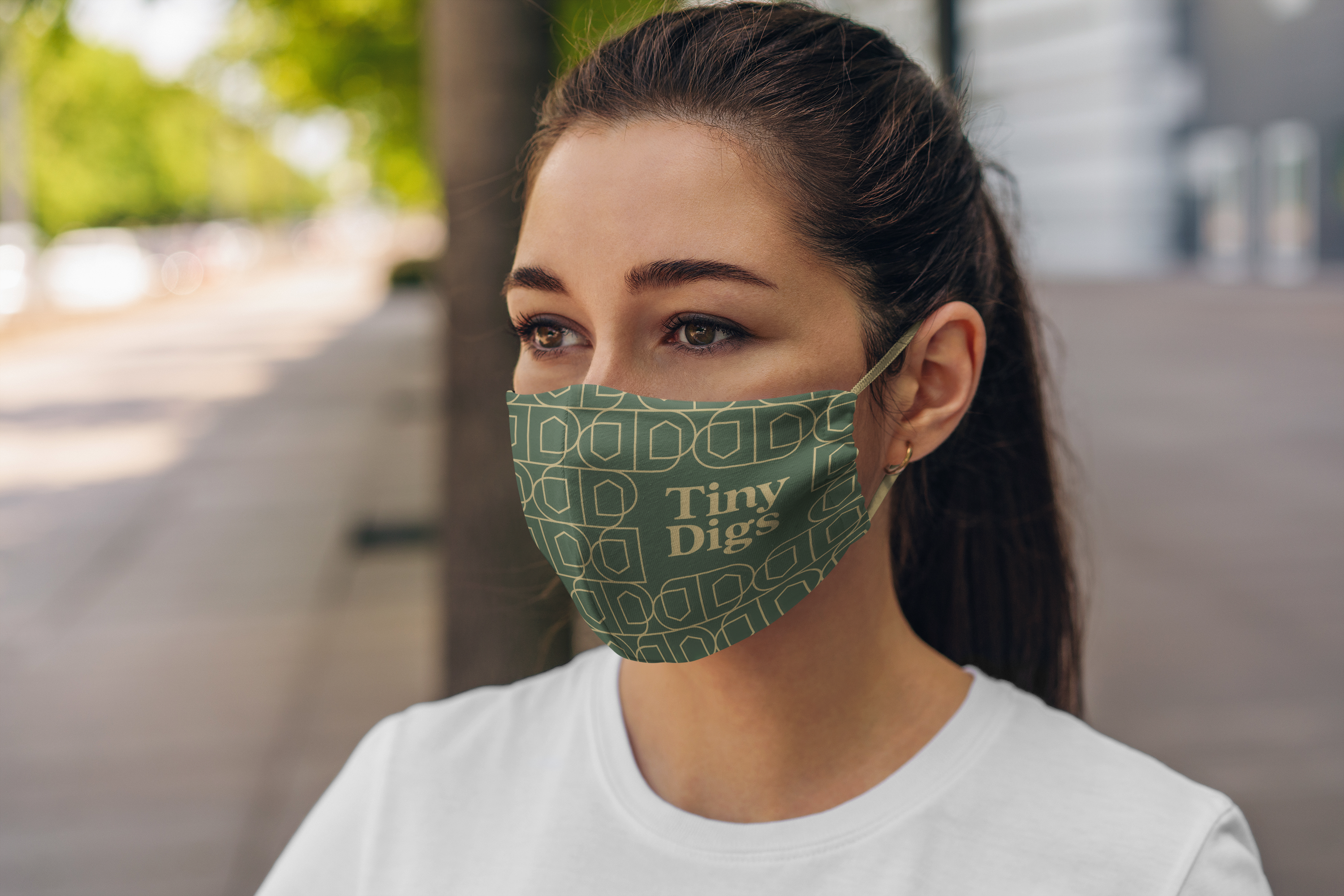
Branding

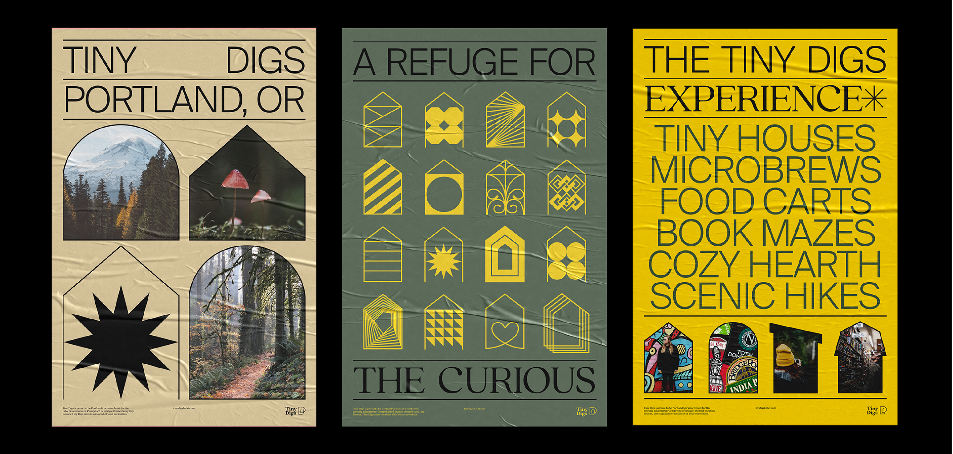
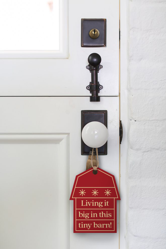
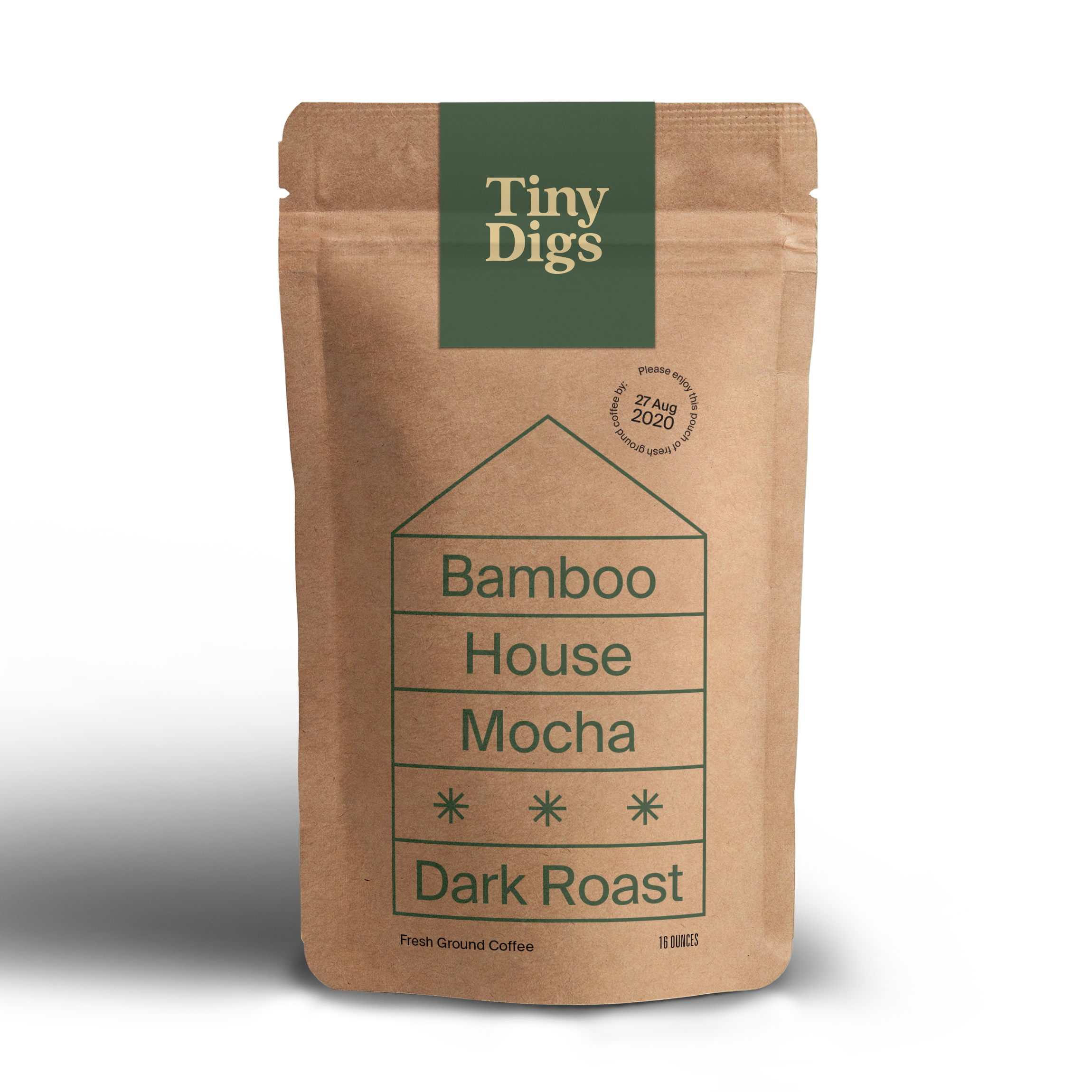
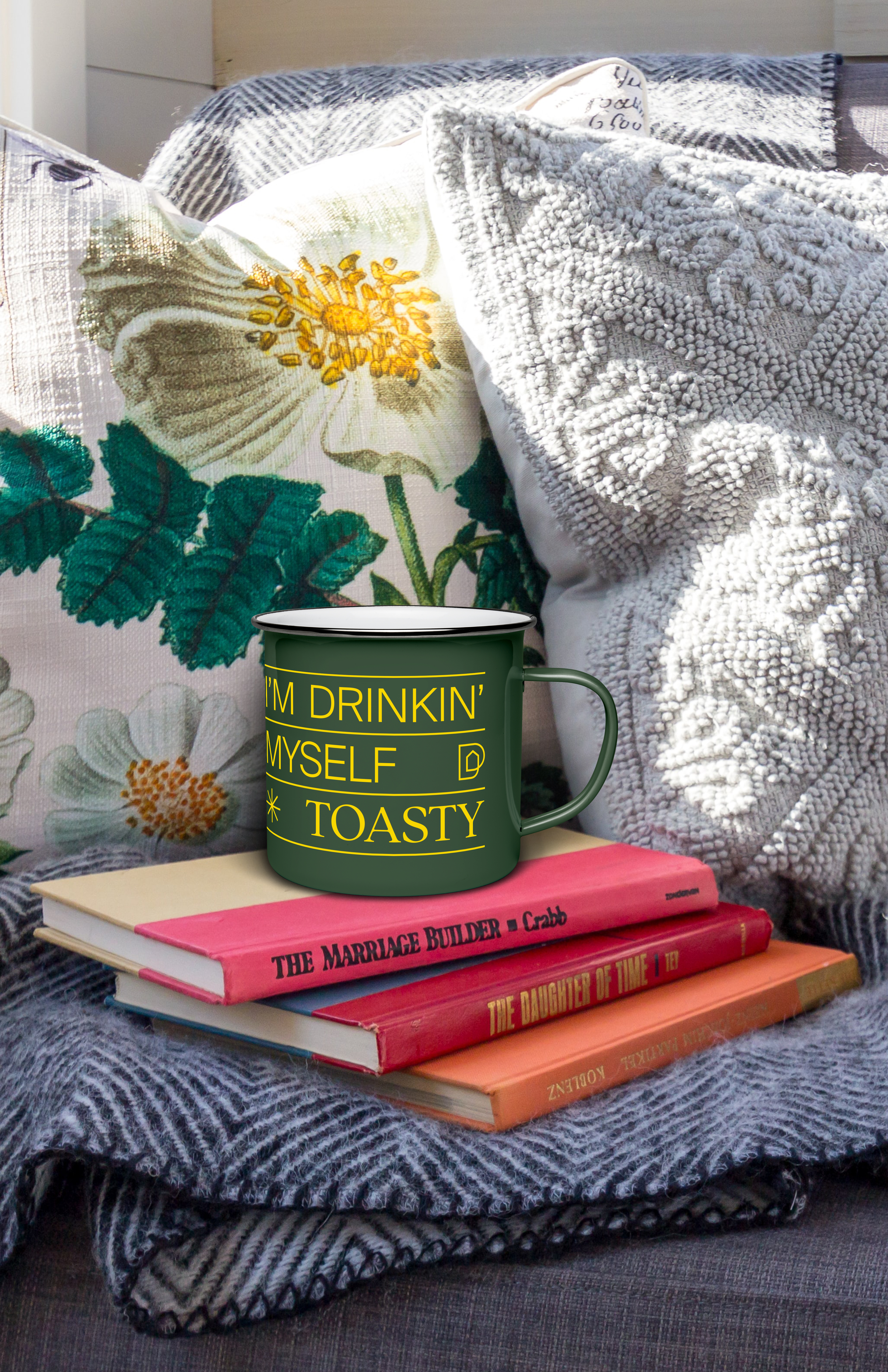
Tiny Digs is a hypothetical hospitality rebranding of Tiny Digs Hotel, a unique hotel of tiny houses in the heart of Portland, OR. Because its current brand presence lacks a strong brand identity, my rebranding of Tiny Digs aims to celebrate Portland’s eccentricities with a vibrant, cohesive, and sophisticated design system. Targeted toward mid-millennials and working professionals, the new Tiny Digs invites them to take part in the city’s tiny house revolution and make it their new home away from home.

Before
After

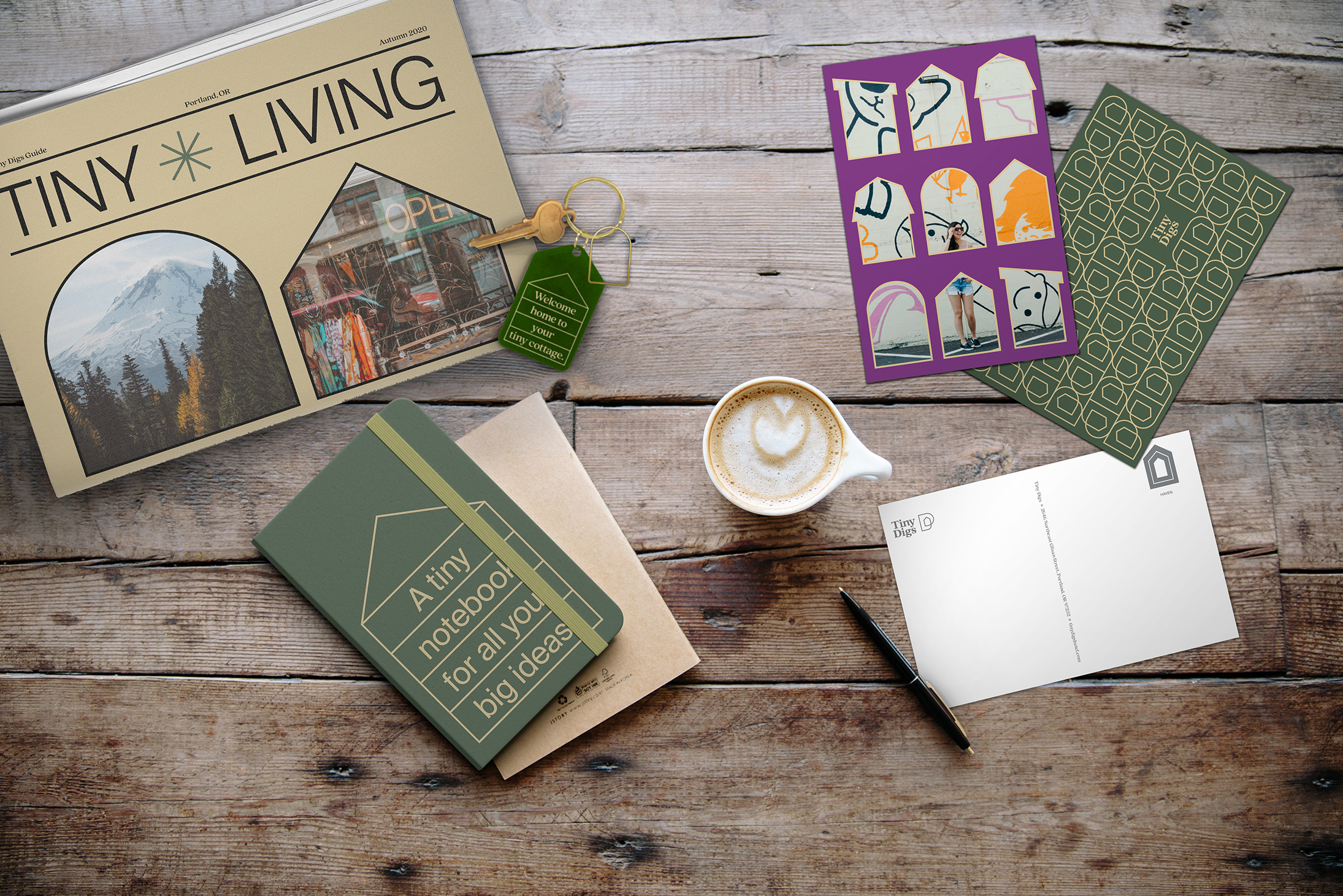
Inspired by the idea of “home away from home,” Tiny Digs is designed to elevate staycations. Because the hotel consists of eight themed tiny houses—Arthur Boxcar, Cabin, Beach House, Gypsy Wagon, Bamboo House, Cottage, Barn House, and Modern House—the challenge is to collectively tease out the personalities of these houses, which influenced the development of the logo extensions of house personalities from the form in the primary logo mark.

Brand application, beginning with postcards, furthered the development of the brand story of Tiny Digs’s personality through emerging visual and typographic elements, which informed the visual language for the lookbook, posters, and brand implementation.


Lookbook & Posters
Brand Implementation


Media
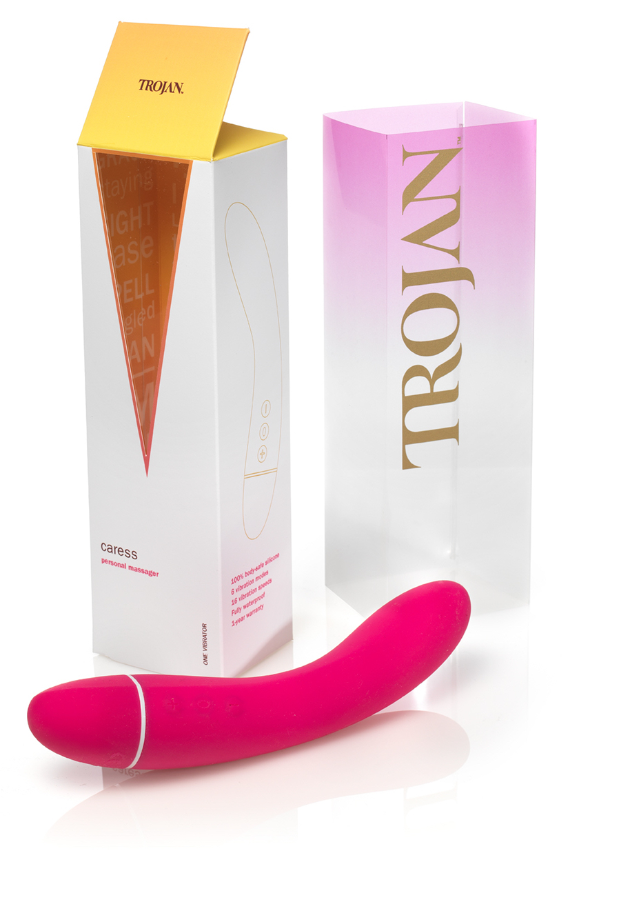
Trojan Rebrand
Package Design
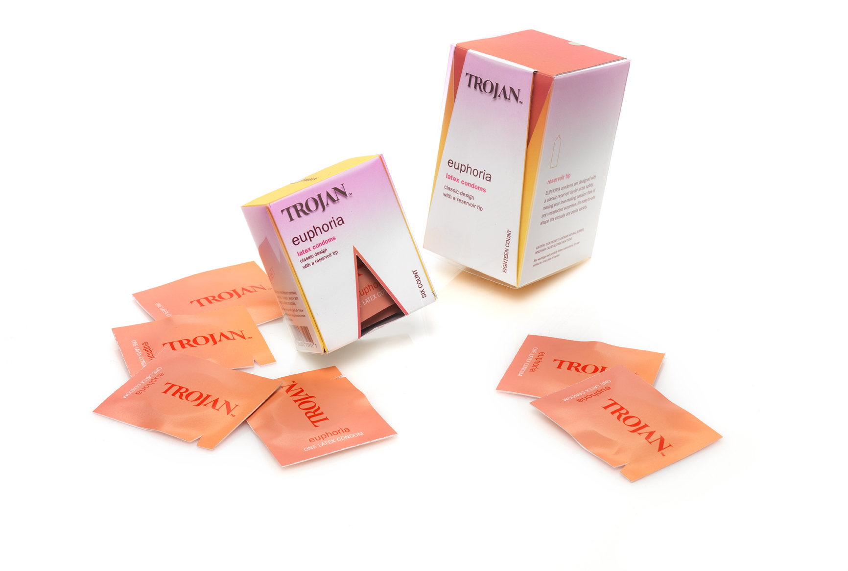
Refreshing a Trusted Brand
In looking at the current brand presence and environment of Trojan, I was tasked to give the classic brand a complete overhaul with a focus on creating a cohesive and elegant package design solution. Drawn from research and applied to form-making and dimensional prototyping, my design approach aimed to help reclaim relationships for busy working professionals.


The opening ceremony of the boxes calls to attention the need to slow things down. It’s not about getting down and dirty for quickies, but about enjoying the process of nurturing intimate connections. Packaging for the vibrator includes an “Easter egg” in its interior panels on which erotic poems are printed to help individuals along in their intimate self-care.

Logo Development
![]()
Form Exploration

Brand in Context


Recognition—
ArtCenter Student Gallery, Summer 2018
ArtCenter Student Gallery, Summer 2018
Credits—
Ania Borysiewicz, instructor
Jason Ware, photography
Roxee Jeong, hand model
Ania Borysiewicz, instructor
Jason Ware, photography
Roxee Jeong, hand model